7 Weebly Web Design Strategies for Better Engagement in 2026

91.5% of all search traffic goes to the first page of results, a fact that flips the script on how much effort a small change can yield.

This guide shows how an intent-first approach to seo and UX can lift engagement and conversions for your website. It focuses on steady organic traffic from google search and other search engines, trading guesswork for measurable steps.

We’ll translate practical best practices into an actionable process you can run inside the editor. Modern themes are responsive and quick-loading, and built-in seo features let you edit titles, meta descriptions, and readable URLs with ease.

Preview: you’ll implement intent-led UX, crawlable architecture, title/meta/URL optimization, long-form authority content, image and video tweaks, speed and mobile improvements, and linking patterns that build authority.

Acting now matters: with most clicks landing on page one, a strong, clear on-page presence and technically sound markup are essential. Webmoghuls brings 40+ years of combined experience to help each title, URL, and description drive real business outcomes.

Key Takeaways

  • First-page relevance drives most organic traffic—prioritize on-page clarity.
  • Use intent-led UX and quick-loading themes to reduce friction and boost engagement.
  • Optimize titles, meta descriptions, and URLs inside the editor for better search performance.
  • Improve images and videos for load speed and accessibility to lift organic traffic.
  • Combine strategic planning with execution steps and measurable goals.
  • Iterate continually: refine structure, content, and links as your business grows.

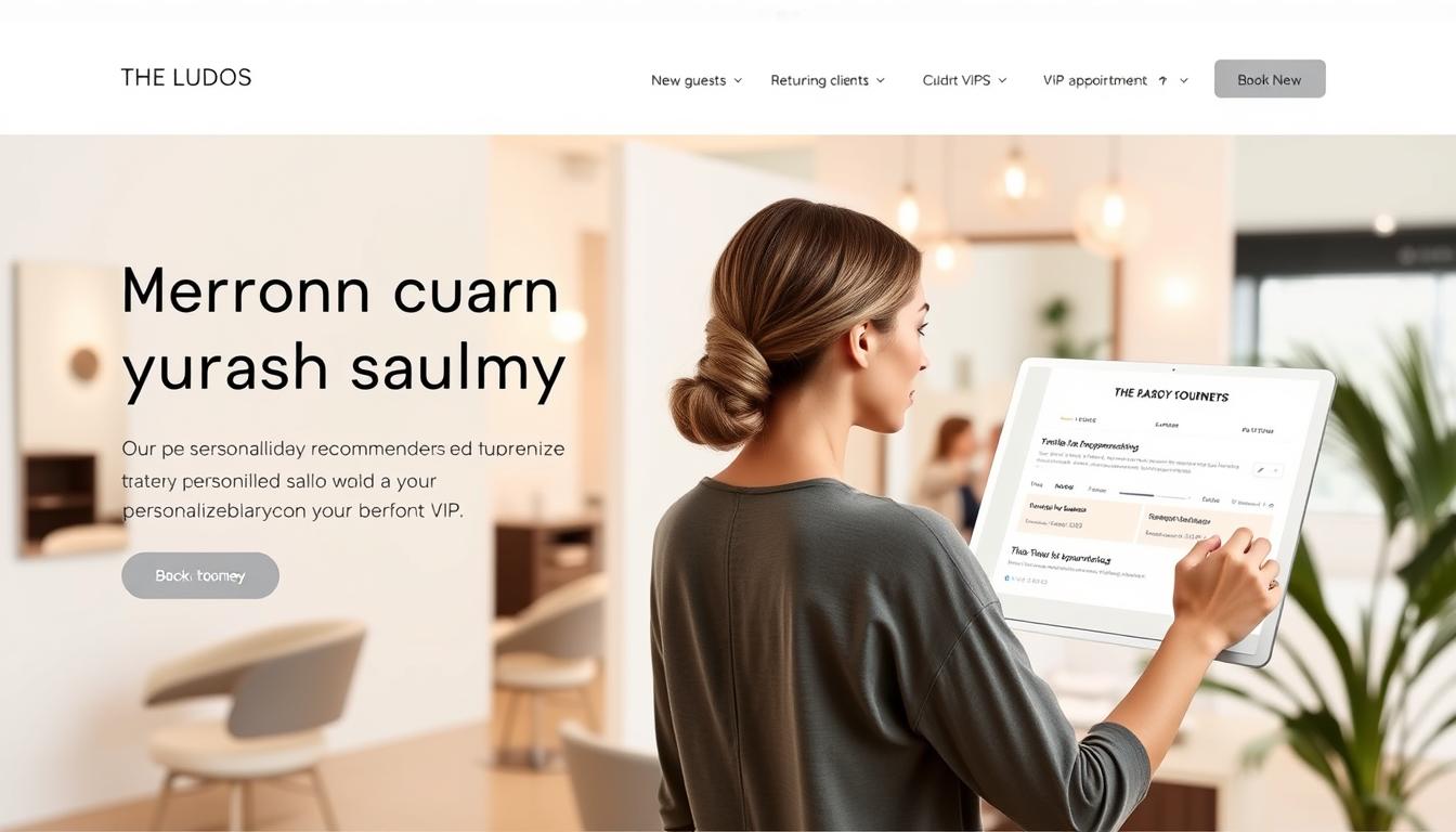
Designing for 2026 engagement: intent-led UX on a simple Weebly foundation

Intent-first layouts turn fast search sessions into clear next steps. A concise value statement above the fold and a single dominant call to action reduce friction and help visitors who expect answers within seconds.

Map primary intents—informational, navigational, transactional—to distinct page templates. Pair each template with targeted headings, compact copy, and one clear CTA so the page fulfills a single goal while offering supportive secondary content like FAQs or proof points.

Use responsive themes as a foundation and prioritize speed and scannability so both people and search engine crawlers grasp relevance at a glance. Apply best practices: descriptive headings, short forms, progressive disclosure, and testimonials near CTAs to build trust quickly.

  • Make sure navigation mirrors the journey from awareness to decision.
  • Integrate internal links and media that signal topical authority without clutter.
  • Establish an editorial guide to keep tone, keywords, and UX patterns consistent across the site.

“Align UX, content, and seo workflows to lift engagement and generate qualified leads.”

Partner with Webmoghuls to match intent-led UX to your business goals and create a measurable path from discovery to conversion, including blog strategies and ongoing site improvements.

Site structure that search engines understand and users love

Clear navigation and purposeful links help people find answers quickly and help engines map your priorities. Start with a slim primary menu that reflects user needs, not internal org charts.

Sequence pages so category overviews summarize options and each page focuses on one task with a clear next step. Limit top-level items to keep the site scannable.

Build clear navigation with custom menus and a logical page flow

Group related pages into intuitive clusters and keep labels user-centered. Use short, descriptive anchor text and avoid generic phrases.

Work around the flat hierarchy with internal linking hubs

Create cornerstone hubs that link to supporting content. This reinforces topical relevance for both users and search engines and prevents orphan pages.

Use header/footer sections to surface key paths and local info

Make sure Contact, Services, Pricing, About, FAQs, and Blog are always reachable. Add NAP details and schema in footer areas to aid local discovery.

  • Submit your xml sitemap and hide low-value pages from indexing to reduce crawl waste.
  • Insert manual H1–H6 headings via custom HTML to express hierarchy where native tools fall short.
  • Audit internal links quarterly to close gaps and align structure to your seo strategy.

“Structure should serve goals: guide people, inform engines, and scale content logically.”

Weebly Design Tips for titles, meta, and clean URLs that win clicks

Optimize the elements users see in search: craft concise title tags, clear meta descriptions, and short, readable URLs that match intent. Use the weebly editor per-page fields to set these values and then QA live pages to confirm rendering.

Title guidance: lead with the primary keyword and a value line. Keep text within pixel-safe limits to avoid truncation and include a scannable modifier (for example, “Pricing” or “Guide”).

  • Write meta descriptions that state benefits and a next step; add a contextual secondary keyword without stuffing.
  • Customize each url: hyphenate words, avoid dates or session strings, and keep paths short and evergreen.
  • When renaming pages or products, plan 301 redirects to preserve link equity and bookmarks.

Tip: maintain a central inventory of titles, descriptions, and target keywords to prevent duplication and speed audits.

Add descriptive image alt text and file names to reinforce relevance, and apply weebly seo features consistently across the site for measurable CTR gains.

Create valuable, long-form content and Weebly blog posts that rank

High-value long-form content turns casual visitors into qualified leads when it answers real questions clearly. Build topics from audience problems and decision stage research so each page serves a distinct intent.

Start with an editorial calendar. Choose subjects with demand, then outline articles with H2/H3 subheadings before writing. This keeps pages scannable and reduces rewrite cycles.

Map topics to search intent and use keywords naturally

Place relevant keywords in titles, introductions, and subheadings without forcing repetition. Signal topical focus while keeping sentences readable and helpful.

Use subheadings and white space to improve readability

Break long text into short paragraphs, lists, and summary blocks so skimmers find value fast. Add charts, screenshots, or short videos with descriptive alt text and captions to reinforce points.

  • Integrate posts into pages: link related blog posts to distribute authority and aid discovery.
  • Include schema (FAQ, HowTo) where appropriate to enhance SERP features.
  • End with action-oriented conclusions and clear next steps tied to your seo strategy.

“Most pages receive no organic traffic; prioritize originality, intent alignment, and measurable goals.”

Webmoghuls’ content approach connects editorial planning with measurable SEO outcomes. For guidance on theme and presentation, see this theme selection guide to ensure your long-form resources are framed for performance.

Weebly SEO Optimization for images and video

Images and video can boost engagement when they’re optimized for speed and described for search engines. Focus on clear, concise alt text and captions so media adds context for visitors and crawlers. Webmoghuls emphasizes performance-aware visual storytelling: balance quality with fast loading to keep users engaged.

Add descriptive alt text to every image. Use short phrases that reflect the page topic and include useful tags or keywords once or twice where natural.

  • Compress files and choose next-gen formats like WebP or AVIF to cut load time and improve Core Web Vitals.
  • Standardize source file names even though the editor may assign generic filenames; reinforce meaning with precise alt text and nearby copy.
  • Implement lazy loading, include width/height attributes, and avoid auto-play or heavy third-party widgets that slow pages.

Embed video thoughtfully

Host long-form clips on YouTube and embed them near supporting copy to increase engagement and the chance of richer snippets. Also use transcripts or short takeaways below videos to add indexable text and help skimmers.

“Balance crisp visuals with lightweight delivery to improve engagement without sacrificing search performance.”

Test media across devices and connections, document media best practices in your team SOPs, and regularly review tags and descriptions so quality and consistency scale with your content library.

Speed and mobile-first performance for 2026

Fast load times and mobile-first layouts are the baseline for keeping visitors and search engines happy. Start with a short performance audit to find scripts, fonts, or media that block rendering. Prioritize fixes that improve first paint and interactivity.

Audit load times; compress media and limit heavy scripts

Run Core Web Vitals and network waterfall checks. Compress and resize images, defer non-critical JavaScript, and remove or limit third-party embeds. These moves cut payloads and lower bounce rates quickly.

Ensure responsive themes render fast across devices

Optimize breakpoints, font loading, and interaction latency so templates stay snappy on phones and desktops. Use the platform CDN and asset caching to reduce round trips for common files.

Reduce bounce with lightweight, task-focused mobile layouts

Design with clear CTAs, large tap targets, and short forms so users complete goals fast. Lazy load non-essential sections and surface critical content first to speed perceived performance.

“Monitor real-user metrics and tie improvements to seo rankings, bounce rate, and conversion lift.”

For a practical checklist and ongoing process, see our top performance checklist. Webmoghuls prioritizes measurable performance wins to boost engagement and conversions while keeping aesthetics lightweight and accessible.

Weebly Website Design 2026, Weebly Design Tips, Weebly SEO Optimization

Start by aligning on-page metadata and crawl signals so each page has a clear role in search results. Configure titles, meta descriptions, and readable URL slugs in the editor to match user intent and primary keywords.

Leverage built-in SEO features: page titles, descriptions, and XML sitemaps

Use the weebly editor to set custom page titles and meta descriptions for every priority page. Make sure image alt text is complete and files are compressed to protect load times and context for search engines.

Submit sitemaps and monitor performance in Google Search Console

Confirm the auto-generated xml sitemap is accessible and resubmit it after major changes. Verify ownership in Google Search Console and review coverage, enhancements, and performance reports to guide on-page refinements.

  • Draft metadata and set url slugs before publishing as part of your launch process.
  • Track impressions, clicks, and average position to spot quick wins for seo rankings.
  • Keep a standards doc so all weebly seo features and naming conventions stay consistent across websites.

“Integrate on-page optimization with technical setup to convert crawlability into measurable traffic.” — Webmoghuls

For hands-on support, consider Webmoghuls’ SEO services to formalize governance and reporting.

Linking that lifts authority: internal paths and authoritative externals

Smart link structures guide visitors and search crawlers toward your most valuable content. Treat links as purposeful signals: they show which page matters and how topics connect across the site.

Create contextual internal links between related pages and blog posts so readers follow a clear learning path. Manual linking in the editor is simple; map these connections in each content brief so new pages join clusters instead of becoming orphans.

Create contextual internal links between pages and blog posts

Use descriptive anchor text that reflects destination context. Short, keyword-relevant anchors help engines and users understand where the link leads. Add links early in the copy to guide engagement and improve click-throughs.

Use reputable external sources and descriptive anchor text

Reference authoritative websites—government, academic, and industry publications—to back claims and add trust. Keep outbound links balanced so they add value without distracting from your core pages.

  • Concentrate authority: link from high-visibility pages to cornerstone resources.
  • Map links: include internal linking in every content brief to support your seo strategy.
  • Audit regularly: check outbound links for rot and adjust tags and targets as needed.

“Webmoghuls’ link architecture ties editorial planning to internal link maps that strengthen topic clusters and business priorities.”

Audits, platform limits, and when to bring in experts

Run scheduled checks to spot metadata gaps, crawl errors, and slow pages before they escalate. Regular audits reveal technical debt and content gaps so you can prioritize fixes by business impact.

Document platform constraints such as the flat hierarchy, limited link attribute control, and the need to embed custom HTML for H1–H6. Note generic image filenames and weaker spam filtering so remediation steps are repeatable.

Practical audit and migration checklist

  • Schedule recurring audits for technical health, metadata quality, internal linking, and content performance.
  • Standardize 301 redirects when renaming pages or products to protect link equity and user journeys.
  • Address multilingual needs early; even though subdomains exist, centralized governance often becomes complex.
  • Harden forms with third-party spam filters and monitor submissions weekly.
  • Create a change management process with QA, staging review, and performance regression checks before publish.

Define thresholds for migration—content volume, taxonomy complexity, or global needs—so leadership knows when to move to a more flexible platform. Webmoghuls offers discovery, custom WordPress development, and SEO services to help businesses outgrow constraints and deliver measurable, long-term results.

“Tie audit findings to a rolling optimization backlog so improvements become an ongoing process, not a one-off project.”

Conclusion

Conclude with a practical roadmap: audit current pages, document priority fixes, and set a 90-day plan focused on high-impact gains. Use Search Console and an xml sitemap to speed discovery and track coverage as changes roll out.

Intent-led UX, crawlable architecture, and tight metadata create a durable foundation for search engine optimization that compounds. Pair clean titles, descriptions, and url structure with long-form posts, smart internal links, and selective external references to lift seo rankings and traffic.

Keep performance management active—speed audits, mobile-first fixes, and media tuning preserve user trust. When scale or complexity grows, plan for migrations or expert help. Partner with Webmoghuls to turn this guide into a tailored roadmap that drives measurable business outcomes.

FAQ

How do I create clear navigation so search engines and users can find important pages?

Build a simple, logical menu with top tasks up front. Use descriptive labels, group related pages, and add internal links from hub pages to support discovery. Keep URLs short and readable so both users and search crawlers understand page purpose.

What’s the best way to handle title tags and meta descriptions within the editor?

Write unique, concise title tags that include a primary keyword and a benefit. Craft meta descriptions that summarize the page and include a call to action. Edit these fields in the page settings and avoid repeating the same text across multiple pages.

How should I plan content to rank for intent-led searches?

Map topics to user intent—informational, commercial, or transactional. Produce long-form posts for deep queries and shorter pages for quick actions. Use subheadings, bullet lists, and white space to improve readability and dwell time.

What image and video practices improve search visibility and load speed?

Compress images, choose modern formats like WebP when supported, and add descriptive alt text. Host videos on YouTube or a CDN and embed them; this can enable richer search snippets while keeping page weight low.

How can I improve mobile performance and reduce bounce rates?

Prioritize a mobile-first layout, limit heavy scripts, and compress media. Use lightweight templates and task-focused pages that load quickly and guide users to conversion points.

When should I submit an XML sitemap and how do I monitor indexation?

Generate and submit an XML sitemap to Google Search Console after major site changes. Monitor coverage reports for crawl errors and indexed pages, then fix redirects, broken links, or blocked resources promptly.

How do I structure internal links to lift authority across the site?

Link contextually between related pages and blog posts using descriptive anchor text. Create hub pages that consolidate authority and pass link value to deeper pages for improved rankings.

What steps should I take when renaming or moving pages to preserve SEO value?

Plan 301 redirects from old URLs to new ones, update internal links, and revise any references in sitemaps or canonical tags. Test redirects so users and search engines follow the correct path.

How often should I run SEO audits and what should I check?

Run audits quarterly or after major updates. Check crawlability, page speed, duplicate content, title/description consistency, image optimization, and mobile rendering. Address platform limits like flat hierarchies or heading constraints.

When is it time to hire an expert for advanced SEO or migration work?

Bring in an expert if your site needs custom schema, large-scale migrations, multilingual support, or performance tuning beyond built-in tools. Agencies or consultants can handle technical fixes, strategic keyword mapping, and complex redirects.

Which on-page elements should I prioritize for better click-through rates from search results?

Prioritize clear title tags, compelling meta descriptions, and readable URLs. Include structured data where appropriate to enable rich snippets and craft headlines that match user intent to improve clicks.

How do I balance keyword use without risking over-optimization?

Focus on relevance and natural language. Use primary keywords in titles and headings sparingly, and distribute related terms throughout body copy. Avoid keyword stuffing and keep density low while ensuring clarity for readers.

Can I leverage built-in SEO tools to improve rankings, and which features matter most?

Yes. Use page titles, meta descriptions, alt text, and the XML sitemap generator. Configure canonical tags and submit sitemaps to search consoles to help indexation and prevent duplicate content issues.

What role do blog posts play in long-term traffic growth?

Blog posts target informational queries, build topical authority, and create internal linking opportunities. Consistent, high-quality posts mapped to search intent attract organic traffic and support conversions over time.

How should I approach external linking to boost credibility?

Link to reputable sources with relevant, descriptive anchor text. Use external links to support claims, improve user trust, and signal topical relevance to search engines while avoiding low-quality or spammy sites.

5 Reasons Responsive Web Design Is Critical in 2026

More than 70% of search queries now come from handheld devices, a shift that changes how audiences find and use your digital presence.

That reality means a single codebase that adapts across screens is no longer optional. It boosts search visibility, cuts maintenance time, and keeps branding consistent.

Webmoghuls, founded in 2012, brings over four decades of combined expertise to craft sites that balance speed, accessibility, and conversion. Our company builds with W3C-validated HTML5/CSS3 and cross-browser techniques to ensure long-term reliability.

In this article, we outline five business-critical reasons these solutions drive revenue — from improved rankings and lower bounce rates to reduced total cost of ownership. Expect practical guidance on strategy, content, SEO, and a mobile-first process that spans scoping, UX, development, testing, and post-launch optimization.

Key Takeaways

  • Higher search visibility comes from a single adaptive site that meets search engines’ preferences.
  • One codebase simplifies updates and slashes maintenance costs.
  • Standards-based builds (HTML5/CSS3) improve reliability and accessibility.
  • Mobile-first engineering balances aesthetics, speed, and conversions.
  • End-to-end services turn your online presence into a measurable growth engine.

Why 2026 Demands a Mobile Ready Website That Performs Across Devices

In 2026, your business must serve visitors on every device or risk losing market share. More than 70% of search queries now originate from handhelds, and about 60% of internet users browse on small screens. That mix directly affects traffic and revenue.

Google favors a single, adaptable site for crawl efficiency and ranking. A single responsive website reduces friction and keeps the user experience consistent across devices. When pages load slowly or feel clumsy, roughly 40% of users leave immediately.

Performance, clear content hierarchy, and intent-focused page structure send more qualified visitors farther down the funnel. At Webmoghuls we tie UX choices to analytics so every change maps to measurable KPIs and business goals.

Metric2026 BenchmarkBusiness Impact
Search from handhelds70%+Higher organic traffic when optimized
Users on small screens~60%Need for clear navigation and speed
Immediate exits if unfriendly~40%Lost conversions and market share

Consolidated code simplifies updates and shortens iteration cycles for services you depend on. Learn more about our approach through this responsive web approach.

Five business-critical reasons responsive website design drives revenue in 2026

A majority of user journeys begin on pocket devices, so capturing intent at the first touch is essential. Webmoghuls ties every initiative to visibility, engagement, and measurable revenue using 40+ years of combined experience.

Meet users where they are

Over 60% of users browse on handhelds and 70%+ of search queries start there. That means your first impression must load fast and match visitor intent.

Boost conversions and lower bounce

Clean layouts, fast loading, and clear CTAs cut friction. When pages feel clumsy, roughly 40% of users leave and often go to competitors.

Win more visibility

One URL across devices consolidates link equity, simplifies crawling, and reduces duplicate content issues—boosting organic visibility and crawl efficiency.

Reduce total cost of ownership

A single adaptable site shrinks design, development, and maintenance time compared to running separate desktop and mobile builds. That lowers ongoing costs and speeds updates.

Future-proof your brand

Flexible systems respond to new screen sizes and devices, protect your investment, and make content reuse simple. Better performance also improves Core Web Vitals and ranking signals.

Ready to align UX, content, and SEO with business goals? Learn about our responsive web design services at responsive web design services.

Responsive Design India, Mobile Ready Website, Cross-Device Web Design

Modern audiences expect layouts that shift smoothly from large monitors to hand-held screens without breaking content flow. Webmoghuls engineers interfaces for clients across the United States and globally, pairing mobile-first thinking with SEO and scalable WordPress development.

Technical foundation: fluid grid layouts map proportions using percentages so visual hierarchy holds at every screen size. Flexible images use max-width and srcset attributes to prevent overflow and cut bandwidth on small devices.

Tailored for every screen size: fluid grids, flexible images, and media queries

Media queries target browser width to set breakpoints where components reflow, not snap. This approach keeps elements readable and interactive as screens change.

Cross-browser compatibility and W3C-validated code for reliability

We validate HTML5/CSS3 to reduce rendering issues and run tests on Chrome, Safari, Firefox, and Edge. That cross-browser QA ensures consistent behavior on modern browsers and popular devices.

  • Performance trade-offs: use lightweight grids or custom CSS for speed-sensitive pages; leverage frameworks like Bootstrap when rapid delivery matters.
  • Progressive enhancement keeps core features stable regardless of client capabilities.
  • Accessibility and brand scale—typography, contrast, and tap targets—are applied at each breakpoint to protect UX and reduce long-term design debt.

Webmoghuls responsive web services that convert and scale

Webmoghuls builds adaptable sites that balance conversion goals with editorial flexibility. Our custom WordPress work centers on conversion while giving editors full control of content.

Custom WordPress design and development

We deliver Custom WordPress Design and WordPress Development that prioritize conversion paths and easy content updates. Templates are lean and modular so updates take less time and cost.

SEO-ready architecture

Semantic HTML, schema where useful, and a clear information architecture make pages easier for search engines to interpret. Internal linking and clean markup support discoverability and ranking.

Performance and launch strategy

Optimized assets, caching, and selective plugins keep pages fast across devices. Our launch plan combines UX, content, SEO, and social support for a coordinated go-live.

Governance, CRO, and ongoing support

We supply design systems and component libraries so new pages match brand rules. Analytics-driven CRO tests refine CTAs and forms to lift conversion without breaking the user experience.

Service PillarPrimary BenefitDeliverable
Custom WordPressConversion-focused templatesModular themes, editor blocks
SEO ArchitectureBetter crawlabilitySemantic markup, IA maps
PerformanceFaster load timesOptimized assets, caching
Support & GovernanceLower maintenanceRoadmaps, updates, security

Our proven process for Cross-Device Web Design success

Our process turns stakeholder goals into measurable steps that guide every sprint and launch. We start with focused discovery workshops that document business aims, audience segments, and success metrics. Those outputs steer content, scope, and the project timeline.

Ideation and discovery: align goals, audiences, and KPIs

Workshops produce persona maps, KPI agreements, and a prioritized backlog. This keeps the team aligned and shortens decision time.

Design and prototyping: mobile-first layouts with intuitive navigation and CTAs

Prototypes validate navigation, hierarchy, and CTAs before code starts. See more on our approach to UI and interaction patterns.

Development: HTML5, CSS3, and modern frameworks for responsive builds

We use semantic HTML5, modular CSS, and selective frameworks to speed development without excess bloat. Code is W3C-validated for long-term reliability.

Testing and launch: device labs, browser stacks, and performance validation

QA covers BrowserStack/device labs, accessibility checks, and metrics for first render and interaction readiness. Post-launch support includes monitoring, hotfix windows, and a prioritized enhancement backlog.

PhasePrimary OutputToolsSuccess Metric
DiscoveryPersonas & KPIsWorkshops, analyticsAligned backlog
PrototypeWireframes & clickablesFigma/SketchValidated navigation
DevelopmentSemantic, modular codeHTML5, CSS3, FrameworksBuild time & payload size
QA & LaunchCross-browser parityBrowserStack, device labPerformance & accessibility

Performance, UX, and SEO: the Mobile Ready Website trifecta

Performance, usability, and findability must be engineered together, not in isolation. That alignment ensures faster loads, clearer journeys, and stronger search outcomes.

Speed matters: optimize CSS/JS, images, and critical rendering for fast loads

We prioritize render-critical CSS and inline only what affects first paint. Nonessential JavaScript is deferred to trim loading time.

Images use srcset and compressed formats like WebP to cut payloads on constrained networks. Caching and CDN policies keep repeat visits fast.

User experience first: clear navigation, zero unnecessary scrolling, and fluid interactions

Navigation patterns are mobile-first, with clear CTAs and reduced friction. Pages avoid long, redundant scrolls that confuse users and reduce conversions.

Fluid interactions use lightweight animation and fast input handling so the experience feels immediate across devices and screen sizes.

Search wins: Google-preferred responsive setup for stronger rankings

One adaptable site consolidates indexing and link equity. Faster pages and better engagement send positive signals to search engines.

We instrument funnels, events, and scroll-depth to measure where UX tweaks lift traffic and conversions.

FocusTechniquePrimary Benefit
Critical RenderingInline critical CSS, defer JSFaster first paint, lower load time
Images & Mediasrcset/picture, WebP, responsive sizingQuality with smaller payloads
Core Web VitalsLCP, INP, CLS monitoringBetter ranking signals
AccessibilityReadable type, contrast, tap targetsImproved engagement metrics

Webmoghuls engineers balance aesthetics and performance so the interface stays elegant without sacrificing speed or search visibility.

Technology stack and compliance for reliable responsive websites

Standards-first engineering cuts bugs, eases onboarding, and protects your investment over years. Webmoghuls picks technologies that favor performance, maintainability, and accessibility for enterprise and mid-market builds in the United States.

Frameworks that scale: Bootstrap, Foundation, and lightweight grids

We weigh frameworks by payload, community support, and alignment with your design system. Lightweight grids or utility CSS get chosen when a custom approach outperforms heavy libraries.

W3C-valid, accessible, and future-ready HTML5/CSS3 builds

Semantic markup, contrast checks, and keyboard navigation are standard. W3C validation reduces cross-browser bugs and speeds future development.

Cross-device, cross-browser testing to ensure consistent experiences

QA uses BrowserStack and device labs, plus performance budgets to prevent regressions. Continuous integration runs automated checks so code quality scales with team size.

  • Content governance: structured content that’s portable and easy to localize.
  • Documentation: proactive technical docs that speed onboarding and reduce time-to-release.
  • Future-ready: guardrails for new screens, interaction patterns, and media formats.
FocusToolsPrimary Benefit
Framework selectionBootstrap, Foundation, SkeletonPerformance & maintainability
Standards & accessHTML5/CSS3, W3CCompatibility & fewer bugs
TestingBrowserStack, device lab, CIConsistent experience on devices

Ongoing support, maintenance, and measurable outcomes

A healthy site is not a finish line but a running program of fixes, tests, and measured growth. Webmoghuls builds long-term partnerships that combine personalized attention with clear metrics.

Transparent project management, updates, and post-launch care

Clear ownership and visible progress come from a project CRM with milestones, attachments, and discussion threads. Clients see timelines, approvals, and version history in one place.

  • Post-launch programs: monitoring, security patching, and performance checks.
  • SLA options: response tiers, incident handling, and change windows to protect continuity.

Continuous improvements: analytics-led UX and SEO enhancements

Quarterly business reviews and KPI dashboards guide an analytics-driven roadmap. We prioritize work that lifts conversions and preserves loading speed.

“Proactive upkeep prevents performance drift and keeps search signals strong.”

PlanResponseDeliverable
Standard48 hrsMonthly audits & patches
Priority4 hrsWeekly monitoring & fixes
Enterprise1 hrDedicated team & roadmap

Content cycles test headlines, CTAs, and layouts across devices. Our support model adapts to your in-house team, augmenting capabilities where needed to drive steady business outcomes.

Why choose Webmoghuls for Responsive Design in the United States and beyond

A single vendor that owns strategy through support reduces friction and speeds time to value. Webmoghuls was founded in 2012 and applies 40+ years of combined expertise to deliver creative, result-driven web design, development, and SEO for clients across the U.S. and worldwide.

Our offering is end-to-end: strategy, user experience, custom WordPress builds, and ongoing maintenance. We follow mobile-first methods, use W3C-validated code, and run cross-browser testing so your site meets performance and compliance expectations.

We assign a dedicated team to each project. That team runs stakeholder workshops, sets clear KPIs, and reports measurable lifts in search traffic and conversion. Our process reduces risk, shortens delivery time, and scales with your roadmap.

  • Track record: 40+ years combined expertise for U.S. market needs.
  • One partner: strategy to support and maintenance.
  • Global delivery: U.S. time-zone overlap and clear communication.

Explore our work with a discovery call or a scoped pilot. Learn more from our New York team at New York web design agency.

Conclusion

Delivering fast, consistent pages across screens is now a core business requirement, not a feature. One standards-based site—W3C-valid HTML5/CSS3, unified URL, cross-browser testing, and performance tuning—lowers risk and maintenance overhead.

The five revenue drivers are clear: broader reach, better conversion, SEO efficiency, lower total cost of ownership, and future-ready adaptability.

Webmoghuls turns strategy into measurable outcomes with a proven process that spans strategy, launch, and ongoing optimization.

Our Custom WordPress design, WordPress development, and SEO services form the technical backbone for scalable growth.

Start a scoped discovery project to validate timelines, ROI, and success metrics. Learn more from our brief trends overview and schedule a consultation to get a tailored plan for your next high-performing project.

FAQ

Why is responsive web design critical for businesses in 2026?

In 2026, more users access sites from varied screens and devices. A flexible site that adapts fluidly improves user experience, boosts engagement, and helps retain customers. It also reduces maintenance costs compared with separate desktop and mobile builds, and supports search visibility by keeping a single URL and consistent content across devices.

How does a mobile‑ready site improve search performance?

Search engines prioritize sites that deliver consistent experiences on phones and tablets. A single, optimized site lets crawlers index content efficiently, improves load times, and reduces duplicate content issues. Combined with clean markup and fast pages, this setup increases the chance of higher rankings and more organic traffic.

What measurable business benefits can I expect from a responsive website?

Expect higher conversion rates, lower bounce, and improved time on site. Consolidating analytics and content management reduces operational overhead. Over time, a well-built site drives more qualified leads and better ROI through improved UX, faster performance, and stronger search presence.

Which technical practices ensure a site performs well across screens?

Use fluid grids, flexible images, and media queries to adapt layouts. Optimize CSS and JavaScript, serve appropriately sized images, and prioritize critical rendering to cut load times. Employ modern frameworks and validate HTML/CSS to ensure cross-browser reliability and accessibility.

How do you test for consistent cross‑device experiences?

Combine physical device testing with cloud-based device labs and browser stacks. Validate interactions, layouts, and performance metrics across common screen sizes and operating systems. Use real-user monitoring and analytics to spot issues in the field and iterate quickly.

What role does content strategy play in multi‑screen success?

Content must be concise, scannable, and prioritized for small screens. Use clear headings, optimized images, and well-placed calls to action. Structure information to serve intent on every device so users can complete tasks quickly, whether browsing on a phone or working on a desktop.

Can a single responsive site lower total cost of ownership?

Yes. Maintaining one codebase reduces development time, hosting complexity, and content management overhead. Updates, security patches, and marketing campaigns apply across all devices, cutting long‑term costs and accelerating time to market for new features.

What accessibility and compliance steps are necessary for modern sites?

Build to W3C standards, follow WCAG guidance, and test with assistive technologies. Ensure semantic HTML, keyboard navigation, readable contrast, and proper ARIA attributes. These steps improve inclusivity, reduce legal risk, and expand your audience.

How do performance and UX combine to affect conversions?

Fast pages and intuitive navigation reduce friction and keep users focused on tasks. Minimizing unnecessary scrolling, simplifying checkout flows, and ensuring interactive elements respond quickly all raise conversion rates. Performance optimization is a direct conversion lever.

What should I look for when choosing a partner to build a cross‑device site?

Choose a team with proven delivery, measurable results, and expertise in mobile‑first builds, content strategy, and SEO. Look for a clear process: discovery, prototyping, development, testing, and post‑launch support. Transparency in timelines, reporting, and ongoing maintenance matters.

How does a responsive approach future‑proof a brand?

A flexible architecture adapts to new screen sizes, form factors, and emerging devices without full redevelopment. Modular components, scalable frameworks, and analytics‑driven improvements let your site evolve as user behavior and technologies change.

What performance metrics should I track after launch?

Monitor page load time, Largest Contentful Paint (LCP), First Input Delay (FID), conversion rate, bounce rate, and mobile traffic share. Track device‑specific behavior and user flows to find opportunities for targeted improvements.

Is WordPress a viable option for scalable, device‑agnostic sites?

Yes. A custom WordPress build with mobile‑first themes, clean code, and optimized architecture can scale well. It supports easy content updates, SEO features, and integrations while allowing developers to implement performance and accessibility best practices.

How often should I update and maintain a responsive site?

Regular maintenance—security patches, plugin updates, performance audits, and content refreshes—should occur monthly or quarterly depending on site complexity. Continuous monitoring and periodic redesigns every few years keep the experience current and competitive.

8 AI UX Tools Every Designer Needs in 2026

Surprising fact: more than 62% of practicing designers now use machine-driven assistants, cutting iteration cycles by nearly half and reshaping how teams ship work.

AI UX Tools 2026, UX Design Software AI, AI Prototyping Tools

This introduction shows how modern design workflows are moving from slow, manual steps to faster, data-backed processes. Webmoghuls, founded in 2012, blends decades of experience to help teams adopt practical systems that speed projects while keeping craft intact.

Expect clear guidance on strategy-led platforms, system acceleration, prototyping, visual generation, and research pipelines. The aim is to reclaim time for higher-order thinking so designers can focus on user empathy and creativity.

Throughout this piece we will point to real platforms and show how the right mix of offerings helps teams validate concepts, deliver on-brand visuals, and scale collaboration. For a deeper look at market trends and platform shifts, see our detailed trend brief at AI-powered UX design trends.

Key Takeaways

  • Adoption is widespread: many designers already rely on smart assistants to speed iteration.
  • Workflows transform: automation frees time for research and creative problem solving.
  • Choose wisely: a balanced stack preserves quality and brand consistency.
  • Data matters: validated concepts reduce risk and improve user outcomes.
  • Experience counts: Webmoghuls’ real-world work supports practical, measurable adoption.

Why AI Is Now Essential to UX Design Workflows

Product teams now lean on smart automation to shorten iteration loops and surface clearer user signals.

Evidence is clear: over 62% of designers use advanced helpers, and iteration speed can improve by up to 50%. Platforms from Adobe, Google, and Figma embed these capabilities to cut repetitive steps and surface data-backed insights.

UX Design Software AI

From manual creativity to automation

Embedded assistants reduce cycle time by automating routine work and highlighting research findings for faster decisions. Teams use them for backlog grooming, hypothesis checks, and documentation so designers spend more time on strategy and users.

What this means for U.S. product teams today

Expect clearer problem framing, faster feedback loops, and better prioritization. Human oversight keeps brand voice, ethics, and accessibility intact while systems scale repeatable tasks.

  • Quick wins (30 days): content drafts, heuristic checks, and preliminary user insights.
  • Governance: log audit trails and strict data controls for enterprise compliance.
  • Business impact: reduced time-to-value, steadier delivery cadence, and higher satisfaction scores.

Start small, measure results, then expand. For a related roadmap on integrating these capabilities across strategy and SEO, see AI-powered SEO strategies.

“Adopt a staged approach: low-risk pilots first, then broaden scope with clear metrics.”

AI UX Tools 2026: The Must‑Have Stack for Modern Designers

A compact stack of smart platforms can move teams from concept to tested screens in hours, not weeks.

Map the core stack: use ChatGPT and Claude for persona generation, research synthesis, and microcopy. Pair those outputs with Figma plus intelligent plugins to accelerate components, layouts, and documentation.

For fast prototyping, rely on Uizard and Visily to convert sketches or screenshots into editable flows. These AI Prototyping Tools cut handoff time and let stakeholders review concrete ideas early.

Visuals come from Adobe Firefly and Midjourney, producing brand-aligned assets and rapid variants. Integrating these platforms reduces rework and keeps color palettes and elements consistent.

  • Strategy: prompt-based persona drafts and task stories that preserve tone and editorial standards.
  • System velocity: generated components and reusable patterns for consistent layouts.
  • Sketch-to-screen: instant wireframes ready for iteration and testing.

Key features to look for: prompt generation, versioning, and asset libraries that preserve traceability. These capabilities shorten cycles, reduce blockers, and boost design confidence.

For a practical guide on pairing strategy with build, see Webmoghuls’ trend brief. Lightweight governance around prompts, brand tokens, and libraries keeps outputs on-brief and measurable.

AI Prototyping Tools

Prototyping and Wireframing That Shorten Time‑to‑Value

Turning rough sketches into working prototypes shortens stakeholder alignment and uncovers real user issues fast.

prototyping and wireframing

Uizard: sketch-to-prototype for rapid validation

Uizard converts hand-drawn ideas and screenshots into clickable wireframes and interactive prototypes. This cuts the time from idea to user walkthrough and lets teams demo flows within hours.

Relume and UX Pilot: scalable components and prompt-based structure

Relume auto-generates layouts and components that plug into existing libraries with little setup. Teams get consistent elements that reduce cognitive load across app flows.

UX Pilot creates wireframes from short prompts so designers can test structure and navigation before building hi‑fi screens.

  • Early demos: gather feedback from stakeholders with working interfaces.
  • Automation wins: remove repetitive steps so designers focus on interactions and edge cases.
  • Repeatable process: scope → wireframe → prototype → test → iterate, with metrics at each stage.

“Rapid prototypes reveal navigation issues and save time by reducing late-stage changes.”

Governance matters: name components consistently, use version control, and enable collaborative comments to keep projects aligned as prototypes evolve.

Visual Design and Asset Creation That Keep You On Brand

A tight visual language—color, type, and imagery—lets teams move from mock to market faster.

visual design elements

Adobe Firefly speeds production by adding generative fill, text-to-image, and asset variants inside Creative Cloud. Designers can create UI illustrations, background treatments, and multiple image variants without leaving their workflow. Non-destructive edits and versioning keep iterations safe.

Palettes and type that support clarity

Khroma produces personalized palettes that align to brand direction. These palettes reduce guesswork and help meet contrast standards for accessibility.

Fontjoy suggests balanced font pairs to improve hierarchy and readability across interfaces. Combined, palettes and typography lift usability for users on web and in app screens.

  • Features that matter: componentized exports, version control, and multi-channel assets.
  • Creative with constraints: explore variations while locking brand tokens and accessibility rules.
  • Rapid production: generate images and elements for landing pages, product screens, and marketing modules.

Workflows we recommend: define tokens, explore with generative features, validate color contrast, then lock assets into a shared library. Webmoghuls delivers on-brand visual systems—color, type, imagery, and components—that reduce rework and speed approvals.

Explore our on-brand visual systems

Research, Testing, and Data‑Driven Decisions Without the Drag

Quick, evidence-backed research and fast tests let teams make better product choices without slowing roadmaps.

Perplexity speeds landscape and domain research by returning concise answers with sources. Teams use those citations to align stakeholders and cut time spent vetting claims.

Maze runs remote usability studies that capture task success, completion time, and friction points. These metrics help prioritize fixes before code lands.

Attention Insight provides predictive heatmaps to rank hero messaging, CTAs, and navigation. Use those visuals to focus work where users look first.

Looppanel tags and clusters interview themes so qualitative feedback becomes searchable and repeatable. That makes common pain points easy to spot.

Notion AI cleans transcripts, summarizes interviews, and produces action lists. Teams move from raw notes to prioritized roadmaps faster.

  • Process: research → prototype → test → synthesize → iterate.
  • Features that matter: easy participant recruitment, clear reporting, and integrations for sharing results.
  • Outcome: data-backed decisions that inform scoping, sequencing, and resource allocation.

“Streamline discovery, run quick tests, then translate findings into a prioritized roadmap tied to business outcomes.”

Governance matters: store artifacts, tag studies, and track decisions so traceability reduces rework and lowers post-release defects. For more on aligning research to product strategy, see custom website design trends.

How to Choose UX Design Software AI That Fits Your Team

Start selection by mapping real projects to candidate feature sets and integration points.

Start with project fit: list the platforms you need for web, mobile, and multi‑platform work. Check file size limits, version control, and handoff pipelines so large projects do not break workflows.

Collaboration and scale: evaluate real-time editing, comment threads, and integrations with Figma and Adobe. Prioritize options that preserve brand tokens and speed cross-functional reviews.

Practical checklist

  • Match features to scope: prototyping, testing, and analytics that support decisions.
  • Measure value: time saved, quality gains, and fewer reworks for each pilot project.
  • Security & governance: vendor roadmaps, compliance, and lifecycle support.
  • Onboarding: docs, training, and support that improve team efficiency.

Run pilots and proof‑of‑concept sprints before full rollout. Prioritize platforms designers already use to reduce change management and align cost to measurable outcomes.

“Evaluate fit, run a small sprint, measure impact, then scale.”

For expert implementation and scale guidance, consider a partnership with Webmoghuls to align tooling with business goals and long‑term maintainability.

From Tools to Outcomes: Building a Smarter 2026 UX Workflow

Start by linking measurable outcomes to every workflow change so effort maps to impact. Define the metric first, then pick the process that moves it. This keeps automation focused and prevents feature drift.

Balance automation with human judgment: let automation assist, not lead

Use automation to remove repetitive tasks while preserving human review for ethics and accessibility. Let designers focus on strategy and storytelling, not routine edits.

Design ops tips: standards, accessibility oversight, and predictable personalization

Establish tokens, components, and content standards so interfaces update predictably. Add real-user testing with assistive tech beyond automated checks to protect usability.

Partnering for measurable impact: how Webmoghuls aligns tooling to business goals

Align roadmaps and KPIs to conversion, task success, and satisfaction. Webmoghuls codifies design ops, governance, and performance budgets to turn experiments into clear insights. For implementation help, consider our web design agency in New York.

  • Use data and insights to guide experiments and iterate fast.
  • Apply component governance so personalization stays consistent.
  • Encourage creativity within constraints; prototype variants and test quickly.

“Sustainable workflows come from balancing automation with human judgment and inclusive practice.”

Conclusion

Wrap up with clear outcomes, not just faster mockups.

The right mix of platforms—ChatGPT and Claude for synthesis, Figma and plugins for layouts, Uizard and Visily for quick app flows, and Adobe Firefly for images—helps teams ship better designs faster. Use research from Perplexity, Maze, Attention Insight, Looppanel, and Notion AI to validate ideas and prioritize features.

Strong, practical next step: audit your current stack, pick one gap to pilot, and measure impact in the next sprint. Align tools, processes, and project goals so designers focus on strategy and usability while repetitive tasks get automated.

Partner with Webmoghuls to select the right stack and prove ROI, then iterate with purpose to keep improving user experiences.

FAQ

What are the core categories of tools every designer should include in a modern stack?

The essential categories are strategy and content intelligence for personas and copy, design system acceleration to speed components and layouts, fast prototyping from sketches to interactive flows, visual asset generation for on‑brand imagery, and research and testing platforms that deliver data and insights. Prioritize integrations that support collaboration, versioning, and accessibility oversight.

How does generative technology change day‑to‑day design workflows?

Generative systems automate repetitive tasks like creating variants, filling layouts, or synthesizing research notes, which frees designers to focus on higher‑value decisions. Teams report faster iteration cycles, more consistent components, and improved time‑to‑market. Designers must still lead with intent and test outputs with real users to avoid drift from product goals.

Which products are commonly used for rapid prototyping and wireframing?

Tools that convert sketches or screenshots into interactive flows, such as Uizard and Visily, speed early validation. Pair those with design platforms that support component libraries and responsive layouts so prototypes scale into production. The goal is to shorten the loop between idea, test, and implementation.

Can visual generation tools maintain brand consistency across projects?

Yes, when used with clear brand guidelines and saved style libraries. Tools like Adobe Firefly and Midjourney produce assets quickly, but teams should enforce palettes, typography, and component rules within the design system to keep visuals aligned with product identity and accessibility standards.

How should teams evaluate research and testing platforms for product decisions?

Choose solutions that provide reliable metrics, rapid user feedback, and integration with design files. Look for citation‑backed research capabilities, usability testing with actionable results, and predictive analytics like heatmaps. The right platform turns qualitative notes into prioritized, measurable insights.

What criteria help decide which software fits a product team’s needs?

Assess project fit, collaboration features, scalability, cost‑to‑value, and data privacy. Examine how a tool integrates with existing workflows, supports design systems, and enables handoff to engineering. Also consider training requirements and vendor support for long‑term adoption.

How can teams balance automation with human judgment to avoid overreliance on generated outputs?

Treat automation as an assistant, not a decision maker. Use generated content and layouts as starting points, then apply user research, accessibility checks, and stakeholder review. Establish review gates and design‑ops standards to ensure quality and ethical outcomes.

What are practical design ops tips for scaling personalized experiences?

Standardize components, document accessibility guidelines, and set testing thresholds for personalization. Maintain a shared component library, automate repetitive tasks like variant generation, and track analytics to measure impact. Clear governance prevents fragmentation as the team scales.

How do collaboration and handoff improve with modern design platforms?

Modern platforms streamline feedback, versioning, and developer handoff by embedding annotations, specs, and tokens directly in files. Real‑time collaboration and plugin ecosystems reduce friction and make it easier for cross‑functional teams to move from prototype to production.

What role do content intelligence and synthesis tools play in research and copywriting?

Content intelligence accelerates persona development, UX copy drafts, and research synthesis by aggregating sources and surfacing patterns. This reduces time spent on manual synthesis and provides consistent language across interfaces, while still requiring human editing for tone and context.

How should organizations measure the impact of adopting these solutions?

Track metrics like iteration speed, prototype‑to‑production time, user task success rates, and conversion or retention changes. Combine qualitative feedback from usability tests with quantitative analytics to tie tooling investments to user outcomes and business goals.

Are there common pitfalls teams should avoid when adopting these capabilities?

Avoid treating generated outputs as final; neglecting accessibility; skipping governance around component libraries; and selecting tools that don’t integrate with engineering workflows. Also watch for overreliance on automation without ongoing user testing and research.

7 Website Speed Optimization Tips for 2026

Fact: nearly 40% of visitors leave if a page takes more than three seconds to render, making every fraction of a second costly.

In 2026, performance is a core business metric. This guide lays out seven clear pillars to raise page speed and protect conversions. We cover measurement, media and code trimming, networking advances like HTTP/2/3 and CDNs, plus back-end tuning for better TTFB.

Founded in 2012, Webmoghuls blends design, WordPress expertise, and SEO to deliver measurable gains. We help brands set targets, hit Core Web Vitals, and keep the technical debt low so pages show meaningful content within three seconds.

Expect pragmatic tactics: fewer requests, smarter images, gzip, async scripts, caching, and careful hosting choices. Treat performance as an operational discipline — test, monitor, and iterate to sustain gains across mobile and desktop.

Key Takeaways

  • Aim to show meaningful content within three seconds to reduce abandonment.
  • Measure with tools like PageSpeed Insights and Chrome DevTools before making changes.
  • Combine protocol, CDN, and caching tactics to cut round trips and delays.
  • Prioritize trimming assets: smaller images, minified CSS/JS, and async scripts.
  • Tune back-end logic and hosting to target sub-200ms TTFB for snappier pages.
  • Make speed a continuous practice, not a one-time project.

Setting the stage for 2026: why speed is the new baseline for growth

Modern brands must treat page responsiveness as a core business KPI in 2026. Consumers expect meaningful content fast, and leadership should tie that metric directly to acquisition and retention goals.

Top desktop sites often show a full page in about 2.5 seconds, while many mobile pages still average near 8.6 seconds. When a page takes longer, bounce rates climb: users judge credibility within seconds and abandon slow destinations.

Search engines factor responsiveness into rankings on both desktop and mobile. That means poor page load and long load times risk lower organic traffic and fewer qualified sessions for marketers who rely on search.

  • Shorter critical paths boost conversions and lifetime value.
  • Setting speed budgets helps teams avoid regressions as features ship.
  • Modern protocols and CDNs future-proof delivery under traffic spikes.

At Webmoghuls, we align design, WordPress development, and SEO to codify guardrails. The result is a resilient site that performs across browsers and devices and protects revenue as paid costs rise.

Why page speed matters now: rankings, conversions, and user trust

Slow delivery drags down visibility, conversions, and brand trust in ways many teams underestimate. Search engines treat responsiveness as a ranking factor, so a sluggish page can cost organic traffic and qualified sessions. Webmoghuls ties technical wins to measurable SEO gains and conversion lifts.

Search impact: Google ranking factors and the cost of slow pages

  • Google considers page load in its signals, so slower pages often rank lower in competitive queries.
  • When competing sites differ by seconds, search placement and clicks shift toward the faster option.
  • Tracking Core metrics and time-first byte helps protect visibility during launches and campaigns.

Revenue and conversions: every extra second reduces sales

Conversion rates fall with each additional second of delay. Small wins—compressing an image or deferring a script—often yield outsized ROI on revenue pages like product and checkout.

User experience and bounce rates within the first three seconds

Around 40% of visitors abandon a website that takes longer than three seconds to show meaningful content.

Users judge reliability quickly; faster experiences lower bounce and raise trust. Make early visual feedback a priority to stabilize metrics while deeper refactors proceed.

Measure what matters before you optimize

Start with measurement: clear metrics prevent guessing and help teams prioritize fixes that move the needle.

Core Web Vitals set the success criteria: aim for LCP ≤2.5s, FID ≤100ms, and CLS ≤0.1 at the 75th percentile. These targets translate directly to better page speed and reduced abandonment.

Time to First Byte and server responsiveness

Time first byte is a foundation metric: under 200ms is ideal, 200–500ms is acceptable, and >600ms needs investigation. Improving first byte boosts downstream rendering and faster contentful paint.

Tools and diagnostic workflow

Use PageSpeed Insights for URL-level analysis, Semrush Site Audit for site-wide trends, and Chrome DevTools to map http requests, file sizes, and per-request timings. Combine lab runs with real user data to capture true distributions across browsers and networks.

Mobile versus desktop

Compare results for mobile and desktop explicitly. Mobile networks and device constraints often reveal hidden bottlenecks that desktop lab runs miss.

  • Define baselines: instrument key pages and set alerts.
  • Prioritize by impact: quantify ms saved or bytes removed per fix.
  • Operationalize: Webmoghuls configures dashboards so stakeholders see measurable progress from day one.

Optimize media and code for faster first paints

Delivering a crisp initial render begins with smarter media and leaner code. Prioritize above-the-fold content and let less important assets wait. Small changes to images and script delivery often cut perceived delays the most.

Right-size and modernize images

Serve responsive sourcesets so the browser picks the correct file for each device. Prefer WebP or AVIF where supported to shrink payloads while preserving quality.

Compress and resize at build time: implement an image pipeline that converts, sharpens, and stores multiple sizes to enforce consistent page weight targets.

Minify and compress markup, styles, and scripts

Bundle critical CSS and minify HTML, CSS, and JavaScript to remove whitespace and comments. Enable gzip or brotli at the server to cut transfer sizes and use cache headers so returning browsers skip unchanged files.

Defer non-critical work and trim blocking requests

Load JavaScript with async or defer and move non-essential scripts to the end of the body. Audit third-party tags and lazy-load below-the-fold images to protect the first contentful paint.

  • Reduce http requests: bundle where it helps the critical path.
  • Standardize pipelines: Webmoghuls integrates responsive images, minification, and script strategies into CI/CD and WordPress builds.

Accelerate delivery with smarter networking

Delivering assets from the nearest edge server cuts transit distance and evens out responsiveness for global audiences. A well-architected delivery network reduces round trips and brings predictable performance across regions.

Use a content delivery network to cache static files at regional edges so the closest server serves images, styles, and scripts. This lowers latency for domestic and international visitors and reduces origin strain during traffic spikes.

Protocol upgrades and fewer handshakes

Switch to HTTP/2 or HTTP/3 to unlock multiplexing and better prioritization. Multiplexed connections let the browser fetch many files without creating multiple handshakes, cutting overhead for critical resources.

  • Deploy a CDN to shorten physical distance and stabilize page load across geographies.
  • Configure edge caching and origin shielding for high-traffic routes.
  • Audit and reduce the number of HTTP requests by consolidating assets where it helps the critical path.
  • Tighten TLS and enable Brotli at the edge to shrink payloads.
  • Validate gains with DevTools: inspect the network waterfall and confirm fewer blocking stages.

CDNs and modern protocols together often produce the single largest latency reduction for global sites.

Webmoghuls selects and monitors delivery platforms, configures caching rules, and tunes edge settings so your pages serve reliably at scale.

Boost back-end performance and hosting resilience

A compact server stack and tuned app logic deliver measurable gains for user-facing metrics. Treat back-end response as a primary KPI and aim to reduce delays before rendering begins.

Time first byte targets matter: under 200ms is excellent, 200–500ms is acceptable, and anything above 600ms needs investigation. Use first byte as a leading indicator of system health and to prioritize fixes.

Reduce TTFB with app, database, and server optimizations

Profile the application to find slow routes. Optimize queries, add indices, and cache expensive results so dynamic pages respond quickly.

Scale vertically (CPU/RAM) or horizontally to avoid queueing during peaks. Keep runtimes and frameworks patched for performance gains.

Choose the right hosting architecture

Match hosting to traffic patterns and budget. Shared plans are cheap but suffer contention. VPS gives isolation. Dedicated servers offer control and consistent throughput. Serverless provides elastic scaling for spiky workloads.

  • Treat TTFB as a health metric: sub-200ms correlates with better page speed and conversion.
  • Tune server settings (keep-alive, TLS, HTTP/2) to reuse connections and cut handshake overhead.
  • Offload static assets to an edge cache so the server handles only dynamic work.

Use observability to watch regional response distributions and detect regressions before they affect conversions.

Webmoghuls aligns architecture with growth targets, validating gains by tracking first byte improvements alongside conversion metrics on key pages.

Caching and redirect hygiene that speeds up return visits

Smart caching and clean redirect maps reduce friction for returning traffic without breaking freshness. Implementing clear policies cuts repeated network trips and helps loyal visitors see content faster.

Enable browser and server-side caching with sensible cache policies

Use browser caching headers to let the client reuse static files on repeat visits. Set cache-control, ETags, and validation rules so the browser revalidates only when necessary.

Configure CDN and server caches for static and semi-static assets. Set shorter rules for frequently updated pages and longer rules for immutable resources to protect freshness while trimming load.

Eliminate redirect chains and keep critical paths lean

Audit and remove redirect chains that add round trips, especially on mobile. Prefer direct redirects from legacy URLs to final destinations to avoid extra hops.

  • Validate cache hit ratios and redirect efficiency with network traces and RUM.
  • Enforce canonicalization, HTTPS, and trailing-slash policies without redundant redirects.
  • Use hashed filenames for cache-busting so updates deploy instantly without losing cache benefits.

Webmoghuls configures cache-control, ETags, and CDN rules and audits redirect maps to boost return-visitor speed while preserving consistency across the site.

Website Speed Optimization, Improve Website Load Time, Fast Loading Websites

Start by targeting the changes that yield the largest user-visible wins: images, delivery, and fewer requests. Prioritize moves that shrink payloads and shorten the critical path before tuning marginal gains.

Prioritize high-impact fixes

Shrink images and serve them from a content delivery network to cut transit and reduce file size. Minify CSS and JS so the browser parses less code. Consolidate assets to lower the number of http requests and simplify the network waterfall.

Use connection hints strategically

Apply dns-prefetch for early DNS lookups and preconnect when third-party domains are critical. Reserve prefetch and prerender for predictable navigations to avoid wasted bandwidth and cache pollution.

Trim plugins and third-party bloat

Audit external scripts and heavy widgets; remove redundant analytics and tag managers or sandbox them on less-critical pages. Enforce performance budgets during builds so new features don’t regress core metrics.

  • Validate fixes on key pages and devices.
  • Keep an inventory of external domains and prune quarterly.
  • Webmoghuls sequences these steps to deliver quick, measurable gains.

“Start with the biggest wins and make them standard practice across your stack.”

Learn practical maintenance tips for long-term efficiency on our low-maintenance WordPress guide.

Operationalize performance: monitor, test, and iterate continuously

Effective performance work pairs real user signals with scripted checks to reveal true bottlenecks. Start by treating monitoring as a product metric and routing anomalies to a triage workflow.

Real User Monitoring (RUM) captures diverse sessions across devices, browsers, and geographies so teams see how actual users experience pages. Synthetic monitoring runs scripted journeys from controlled locations to give repeatable baselines.

Real User Monitoring versus synthetic monitoring for complete visibility

RUM shows variability in traffic and reveals long-tail regressions that matter to conversions. Synthetic checks isolate regressions and confirm whether a change affects critical journeys like checkout or onboarding.

Schedule site-wide audits and track Core Web Vitals trends over time

Run automated audits weekly or after major releases. Use PageSpeed Insights and Semrush Site Audit for diagnostics and trend reports that focus on contentful paint and input delay.

Create a performance playbook: budgets, alerts, and regression checks

Build clear budgets for page weight, requests, and LCP so teams can accept or reject features against measurable limits. Configure alerts on threshold breaches so engineers can act before users notice slow page load.

  • Pair RUM with synthetic checks for broad coverage.
  • Integrate performance checks into CI/CD to catch regressions in seconds.
  • Turn telemetry into prioritized sprints and stakeholder-ready reports.
Monitoring TypeData SourcePrimary UseCommon Tools
Real User MonitoringBrowser RUM scriptsCapture true user experience across regionsNew Relic Browser, Google RUM, Datadog
Synthetic ChecksControlled crawlersBaseline journeys and regression testsWebPageTest, Lighthouse, Pingdom
CI/CD GatesPre-deploy runsStop regressions before releasePageSpeed Insights API, Lighthouse CI

“Pairing RUM and synthetic monitoring turns telemetry into action and keeps performance work aligned with business outcomes.”

Webmoghuls deploys monitoring stacks, sets budgets and alerts, and runs recurring audits. This converts metrics into prioritized backlogs so limited engineering time targets the highest-impact fixes and sustains a better user experience.

Conclusion

Turn performance work into a repeatable program that protects revenue and search visibility. Invest in page speed: when pages hit Core Web Vitals and render in under three seconds, bounce drops and conversions rise.

Focus your efforts. Measure first, then cut media weight, trim code, adopt CDNs and modern protocols, reduce TTFB on the server, and lock in gains with caching and clean redirects.

Webmoghuls is your partner for speed in 2026 — blending design, WordPress development, SEO, and engineering to make your website a reliable, high-converting site across the United States and global markets.

FAQ

What key metrics should I measure before starting performance work?

Start with Core Web Vitals—Largest Contentful Paint (LCP), First Input Delay (FID) or Interaction to Next Paint (INP), and Cumulative Layout Shift (CLS). Also track Time to First Byte (TTFB), total HTTP requests, and overall page size. These metrics give a clear baseline for user experience and server responsiveness.

How can a content delivery network (CDN) improve global response and load rates?

A CDN caches assets at edge locations close to users, reducing latency and packet travel time. This lowers TTFB for static files, cuts round trips, and reduces the number of expensive origin requests—improving Largest Contentful Paint and perceived performance across regions.

Which image strategies yield the biggest gains without losing visual quality?

Use modern formats like WebP or AVIF, serve responsive srcsets, and apply right-sizing plus lossless or perceptual compression. Implement lazy loading for offscreen media and use efficient caching headers so repeat visits load quickly.

What is the difference between real user monitoring (RUM) and synthetic testing?

RUM measures actual visitors in real networks and devices, revealing real-world performance and geographic variance. Synthetic tests run scripted page loads from specific locations to reproduce issues and compare lab metrics like Lighthouse or PageSpeed. Use both for complete visibility.

How many HTTP requests are too many, and how do I reduce them?

There’s no fixed cap, but more requests increase latency and slow first paints. Reduce requests by bundling or deferring nonessential scripts, inlining critical CSS, compressing assets, using image sprites or SVGs, and removing unused plugins or third-party widgets.

When should I adopt HTTP/2 or HTTP/3?

Move to HTTP/2 immediately if your host supports it—multiplexing and header compression cut overhead for many small assets. Upgrade to HTTP/3 when available to gain better loss recovery and faster handshakes, which help mobile and lossy networks.

How can I lower Time to First Byte (TTFB) for dynamic pages?

Optimize back-end logic, database queries, and caching layers. Use an application cache or edge compute for common responses, tune web server and PHP/Node settings, and consider a stronger hosting tier or autoscaling to prevent queuing under load.

What caching strategies should I implement for faster repeat visits?

Apply long-lived cache headers for static assets, use immutable caching for versioned files, and enable server-side caching (Varnish, Redis, or built-in platform caches) for rendered pages. Set sensible stale-while-revalidate rules to balance freshness and speed.

How do third-party scripts affect interactivity and input delay?

Third-party scripts—analytics, ads, social widgets—can block parsing or execution, increasing First Input Delay and overall CPU time. Audit third-party tags, lazy-load nonessential scripts, and run them in web workers or deferred to protect main-thread responsiveness.

What tools should I use to monitor Core Web Vitals over time?

Combine PageSpeed Insights and Lighthouse for lab data, Chrome DevTools for debugging, Google Search Console for field metric trends, and RUM platforms like Google Analytics 4 or open-source alternatives for continuous tracking of Core Web Vitals.

Which optimizations deliver the fastest wins for conversion and retention?

Prioritize image modernization, enabling a CDN, minifying and compressing CSS/JS, and removing render-blocking resources. These reduce Largest Contentful Paint and interactive delays, which directly improve engagement and conversion rates.

How should I manage redirects and why do they matter?

Eliminate redirect chains and unnecessary 302/301 hops, especially on critical paths. Each redirect adds latency and wastes time before the browser can fetch the final resource, harming both TTFB and first paint metrics.

What role do resource hints (preconnect, dns-prefetch) play?

Use preconnect and dns-prefetch to warm up TCP/TLS handshakes and DNS resolution for third-party origins you rely on. Preload critical fonts or hero images to ensure they’re fetched early, improving Largest Contentful Paint without aggressive resource blocking.

How often should I run site-wide performance audits?

Schedule audits monthly or after major deployments. Also run checks after design changes, new integrations, or traffic spikes. Continuous monitoring with alerts helps catch regressions before they impact users.

When is it worth migrating to a different hosting architecture?

Consider a migration when current hosting causes consistent high TTFB, frequent outages, or cannot scale with traffic. Evaluate VPS, dedicated, managed cloud, or serverless platforms based on expected load, latency requirements, and operational overhead.

How do I create a performance budget and enforce it?

Define limits for metrics such as LCP, total page size, and number of requests. Integrate budgets into CI/CD with automated Lighthouse checks and fail builds when thresholds are exceeded. Pair budgets with a playbook for escalation and mitigation.

Are minification and compression still important with CDNs and modern protocols?

Yes. Minifying CSS, HTML, and JavaScript reduces payload size, while gzip or Brotli compression cuts transfer bytes. Combined with a CDN and HTTP/2 or HTTP/3, these techniques lower both network and processing time for faster first paints.

7 Beauty Salon Web Design Ideas to Attract Clients in 2026

Fact: 72% of first-time visitors decide to book within 30 seconds when a site shows clear pricing and a visible “Book Now” CTA.

Salon Web Design 2026, Beauty Website Design, Spa UX UI

The right mix of clean visuals, fast performance, and a direct booking path turns casual visitors into paying clients. Examples like Albrecht’s and La Maison pair sticky headers and clear CTAs to cut friction and improve results.

Hero imagery, subtle motion, and a consistent color palette set the tone without slowing the page. Real images, short reviews near CTAs, and simple menus build trust and make appointment choices easy.

Webmoghuls blends strategy, custom WordPress work, and SEO to align creative site work with business goals. This article previews seven practical ideas, backed by real examples, to help a beauty salon site welcome more clients and grow bookings.

Key Takeaways

  • Clear CTAs and structured pricing speed booking decisions.
  • Real photos and short reviews near CTAs build trust.
  • Center-aligned layouts and minimal menus reduce friction.
  • Mobile-first flows and ecommerce add-ons boost product sales.
  • Consistent color palette and tasteful motion reinforce brand style.

Why 2026 Is Different: Evolving Client Expectations in Beauty and Spa UX UI

Today’s visitors judge a salon site in seconds; a short, clear booking path wins their business. Successful shops cut steps to appointment with visible booking actions and clear service categories.

From browsing to booking: persistent headers, center-placed CTAs, and plain-language service labels keep navigation simple. THP Hair and La Maison show how sticky headers and top-menu booking links reduce friction.

Visual storytelling that proves results pairs real client photos, short reels, and micro-testimonials near CTAs. These quick proof points calm decision anxiety and speed conversions.

Subtle motion—ripple accents or soft parallax—adds delight without masking key info. Mobile-first layouts, touch-friendly controls, and fast media now set the baseline experience for on-the-go discovery.

  • Show pricing ranges, treatment durations, and stylist availability early.
  • Use analytics to measure the funnel and trim weak steps.
  • Keep labels plain so clients find services, hair treatments, and bookings fast.

Webmoghuls brings global perspective and 40+ years of combined expertise to align UX with business goals for salons and spas, helping turn visitors into repeat clients.

Salon Web Design 2026, Beauty Website Design, Spa UX UI

High-intent searches shape how pages should be organized: focused service pages win both traffic and bookings. Map queries like “balayage pricing near me” or “same-day blowout” to single pages with clear titles and quick answers.

Make each service page work hard. Use short descriptions, pricing ranges, images, and a visible booking CTA. Add concise FAQs that answer time, prep, and aftercare questions to capture long-tail searches.

Structure navigation so related treatments, stylists, and product pages link naturally. This reduces clicks and raises engagement. Include stylist bios on relevant pages so clients pick with confidence.

  • Local pages: add city or neighborhood content with consistent NAP for search visibility.
  • Product tie-ins: list items used in treatments to capture shoppers and boost cross-sells.
  • Track intent: monitor Book Now clicks, scroll depth, and tab views to refine content.

Examples like Albrecht’s, Jo Hansford, Voodoo Lounge, and Voila show how intent-aligned navigation and clear pricing speed decisions. Webmoghuls aligns content strategy and site architecture so search queries map directly to booking paths.

Idea One: Seamless Online Booking That Converts on the First Visit

A fast, friction-free booking flow turns curious visitors into confirmed appointments within minutes. Make the booking action obvious with a persistent Book Now button in the header and a secondary CTA above the fold so clients never hunt for the next step.

salon website

Prominent placement and one-click flows

Sticky navigation keeps the CTA visible as users scroll. One-click flows or overlays, like the Mangomint widget example, reduce page loads and speed conversion.

Show key info before the calendar

Surface stylist availability, service categories, pricing ranges, and estimated durations before asking for dates. DBK’s flow that shows preferred hair pros and time slots cuts abandonment.

Mobile-first widgets and calendar UX

Use large tap targets, clear progress steps, autofill for returning clients, and timezone clarity. Send confirmation emails/SMS with add-to-calendar links and inline confirmations to lower no-shows.

  • Filter by service and stylist to speed choice.
  • Show deposits and cancellation rules up front to avoid surprises.
  • Integrate POS/CRM so schedules sync and follow-ups close the loop.

“Make booking feel like a helpful conversation, not a form.”

Track every step with analytics to spot drop-offs and iterate. Webmoghuls builds these flows in custom WordPress, tying scheduling tools to measurable conversion tracking.

Idea Two: High-Impact Visuals with Clean Layouts and Soothing Color Palettes

Well-chosen colors and a clean layout make services feel premium and easy to scan. Pick a main palette with clear contrast and one restrained accent color for CTAs.

Soft pastels and warm neutrals create a calm atmosphere for relaxation treatments and product pages. Use generous white space, a consistent grid, and uniform image frames to make before-after photos read clearly.

Bold black-and-white works for trend-driven hair salons and editorial style. Keep accents to guide the eye to booking buttons and product CTAs.

Motion and performance

Micro-parallax, gentle fades, and a subtle ripple hero add polish when used sparingly. Pair hero video with a static fallback, captions, and a short autoplay policy to protect first paint.

  • Compress images and lazy-load galleries.
  • Defer non-critical scripts to keep mobile speeds high.
  • Maintain accessible contrast ratios for text and interactive states.

Webmoghuls’ designers match color theory to business goals so the site looks elegant while staying fast and usable. Align palette, typography, and imagery across services and product pages to build trust and lift bookings.

Idea Three: Trust Builders — Real Client Photos, Reviews, and Social Proof

Authentic client stories and clear social proof cut hesitation and nudge visitors toward booking. Place concise testimonials adjacent to booking buttons so proof appears at the moment of action. Short quotes with a star rating reduce doubt and boost conversion.

Use real client images with permission and consistent lighting to show realistic results. Add microcopy that notes minimal retouching and editing to maintain trust.

Short-form testimonials near CTAs

Keep quotes tiny—one or two lines—so they don’t interrupt flow. Link review snippets to full profiles on Google or Yelp for transparency.

Instagram grids and stylist spotlights

Embed a curated feed that highlights recent work and tag stylists. Create small spotlight cards with specialties, certifications, and a mini-gallery to help clients choose confidently.

  • Place testimonials next to booking CTAs to increase completion rates.
  • Automate review requests after appointments to build fresh social proof.
  • Include a photo release in intake or follow-up messaging.
  • Track uplift in booking when social proof is near CTAs to optimize placement.

“Short, authentic proof at the point of decision lifts bookings and reduces returns.”

For implementation ideas and technical patterns, see custom website design trends from Webmoghuls. Their modules combine user-generated content, review feeds, and testimonial layouts to align social proof with measurable booking outcomes.

Idea Four: Mobile-First Spa UX UI for On-the-Go Clients

A pared-back mobile layout that puts core actions up front converts casual browsers into scheduled clients. Prioritize a stacked content flow, large tap targets, and concise copy so essential tasks feel effortless on small screens.

mobile-first salon website

Keep booking, contact, and directions one tap away. Use a persistent header or a floating action button so booking and call functions are always visible. Include click-to-call and map deep links to reduce friction.

Optimize media for phones: adaptive image sizes, muted video by default, and tight performance budgets. Readable typography, high-contrast color choices, and predictable spacing help visitors scan quickly.

  1. Respect thumbs: place primary CTAs inside natural reach zones for one-handed use.
  2. Simplify navigation: limit top items and use plain labels so visitors find services fast.
  3. Reduce form friction: enable autofill, minimal inputs, and progressive disclosure for optional fields.

Test on varied networks and older devices, track mobile path drop-offs, and iterate. For hands-on help building mobile-first UI patterns, see mobile-first UI patterns and workflows that keep the booking path short and clear.

“Design for the smallest screen first — then scale up.”

Idea Five: Product and E-commerce Integration for Added Revenue

A smart product strategy makes aftercare purchases feel like natural next steps. Tie retail to treatments so clients leave with a plan and the items they need to keep results visible at home.

Clean beauty, bundles, and post-appointment upsells

Match products to services. Feature clean beauty lines, aftercare kits, and stylist picks on treatment pages so recommendations are contextually relevant.

  • Bundle offers: timed post-appointment emails or SMS that suggest a follow-up kit to extend results.
  • Scannable product pages: quick benefits, ingredients, how-to tips, and stylist notes for easy decisions.
  • Fast checkout: inventory indicators, quick add-to-cart, express checkout, and mobile-first flows to cut abandonment.

Reward repeat purchases with loyalty points or membership perks that combine services and retail. Cross-link products from booking confirmations and stylist bios to increase discovery.

“When retail mirrors in-salon advice, clients buy with confidence and keep coming back.”

Measure the impact: track how product purchases affect service retention and AOV. For implementation details on ecommerce and custom WordPress work, see a short guide from Webmoghuls.

Idea Six: Black-and-White Editorial Styles for Modern Hair Salons

A monochrome editorial approach lifts a hair brand into the realm of fashion magazines while keeping appointments front and center. Use bold type and high-contrast imagery to create an immediate, upscale impression for clients.

Pair dramatic typography with generous white space and a consistent grid so images read like feature spreads, not cluttered galleries. SOHO Hair Hero, Tiara Salon, and Salon Sona show how split-screen and asymmetric layouts tell a story while staying usable.

Add one limited accent color to guide attention to booking CTAs and key navigation. Keep motion subtle—parallax micro-shifts or gentle reveals—to add polish without hurting performance.

  • Show curated images focused on texture, cut, and finish with consistent lighting.
  • Meet high-contrast accessibility standards, including clear focus states and readable text on media.
  • Keep pricing, services, and appointments easy to find despite the editorial look.
  • Feature stylist portraits and minimal bios to match the aesthetic and build trust.

“An editorial palette can elevate brand perception while still driving measurable bookings.”

Idea Seven: Personalized Journeys — New Guests, Returning Clients, and VIPs

Guiding new guests through a clear onboarding flow reduces doubt and speeds first bookings. Segmented journeys treat different visitors with the right steps: a newcomer needs orientation; a returning client wants fast rebooking.

personalized salon website

Practical elements that convert:

  • Create a dedicated new guest onboarding page that sets expectations, lists popular services, and answers top questions.
  • Add a stylist matching quiz based on hair type, style goals, and availability to route clients to the best pro.
  • Offer returning clients one-tap rebooking and access to past services for a frictionless experience.
  • Design VIP journeys with memberships, priority booking windows, and exclusive offers to reward loyal clients.

Keep pricing ranges and time estimates visible early. Include pre- and post-care information on service pages and in confirmations to support results.

Operational & measurement notes

Use progressive profiling so the site asks only for essential information at first. Align on-page recommendations with past bookings and track segment-level conversion and retention to refine journeys.

“Map digital flows to real front-desk actions so the experience feels seamless from site to salon.”

For implementation patterns and AI-powered UX ideas, see AI-powered UX patterns from Webmoghuls.

Navigation That Makes It Easy: Clear Menus, Service Pages, and Pricing Transparency

Clear menus and immediate price cues cut confusion and speed a visitor to booking.

Keep essentials front and center. A concise primary menu with Services, Pricing, Stylists, Locations, and Book Now helps visitors find answers fast.

Use sticky headers, a bottom action bar, or off-canvas menus so booking and contact actions are always available. Place pricing ranges on each service page and keep a full price list in one easy-to-find location to build trust.

  • Choose descriptive labels over brand jargon so visitors know what each link contains.
  • Include breadcrumbs and section anchors on long pages to orient users quickly.
  • Add an FAQ entry for each major service to reduce calls and speed decisions.
  • Keep location pages consistent with hours, parking, maps, and direct booking links.

Position key actions near the visual center on mobile to support one-handed use. Test navigation with real users and refine labels and order based on click data. Ensure accessibility with visible focus states, logical tab order, and ARIA labels for menus.

For a quick IA checklist and example patterns, see our top IA checklist.

“Make navigation act like a guide—simple, honest, and always steering visitors toward the appointment.”

Content That Inspires: Hairstyles, treatments, and seasonal hair care tips

Editorial hubs that pair tips with clear service links inspire visitors and simplify the path to appointment.

Publish seasonal guides on hairstyles, treatments, and hair care tips that answer common questions. Short how-tos and video reels capture search demand and give stylists a voice.

Curate before-after galleries with concise captions to set realistic expectations. Integrate Instagram and short-form video to show techniques, transformations, and personalities.

  • Pair inspiration with action: link each post to the related services and recommended products.
  • Group content: sort by hair type, goals, and occasions for easy browsing.
  • Technical SEO: add schema markup and internal links to service and location pages.

Webmoghuls builds editorial frameworks for ongoing blogs, galleries, and reels that drive organic traffic and support bookings. Track which formats drive the most appointments and refresh evergreen guides regularly.

Examples and Inspiration: What Top Salon Websites Do Right

Great salon pages use practical patterns that guide visitors quickly from inspiration to appointment. This section highlights real examples and the simple choices that lift conversion and brand clarity.

salon website

Sticky headers, minimal menus, and center-aligned layouts

La Maison keeps booking visible with a sticky header. Salon64 uses a bottom action bar that keeps core actions within thumb reach.

Minimal menus and center-aligned layouts focus attention on images and CTAs. That reduces clicks and speeds decisions.

Unique touches: split screens, off-canvas menus, and subtle animations

  • Split-screen storytelling like Tiara Salon that pairs before/after shots with short CTAs.
  • Off-canvas menus and ecommerce from Jo Hansford for a clean shopping flow.
  • Ripple hero effects at Yukie Natori that add polish without slowing the site.
  • Location-aware booking from DBK so visitors pick the nearest studio fast.
  • SOHO Hair Hero’s black-and-white panels that elevate editorial results.

Webmoghuls curates winning patterns and adapts them to each brand’s goals to drive measurable results. Test new patterns in low-risk areas, then scale the winners.

Platform and Tech Choices: WordPress, Custom WordPress Design, and No-Code Builders

Start with the questions: who will maintain the site, which tools must integrate, and how fast should pages load?

When to use themes vs custom builds

Quick-launch themes (Divi, TheGem) versus custom WordPress

Themes speed up a salon website launch and often include starter pages for services and products. Divi and TheGem are robust for rapid, branded rollouts.

Custom WordPress work pays off when you need unique flows, advanced integrations, or strict performance targets. Webmoghuls builds custom themes that balance speed and features.

Performance, security, and editorial workflows

Optimize hosting, caching, and image handling to keep pages fast under load. Harden logins, schedule managed updates, and add CDN/WAF for protection.

Design CMS workflows so a small team can edit services, pricing, and promos without a developer. Plan booking, CRM, POS, and analytics connections from day one.

  • Design systems and component libraries keep brand color and layout consistent.
  • Localization readiness supports expansion to other cities or languages.
  • Training and docs empower internal teams to own content and process changes.

“Choose the platform that fits daily operations, then build safeguards for speed and security.”

SEO Essentials for Beauty Website Design in 2026

A search-first approach combines city pages, schema, and concise service copy to capture high-intent clients. Focused SEO turns local searchers into bookings by answering intent fast.

Local SEO, services schema, and city pages for multi-location businesses

Start with fundamentals: set up Google Business Profiles, consistent NAP, and dedicated city pages for each location. Add LocalBusiness and Service schema so search engines show key info like hours, price ranges, and reviews.

On-page keyword placement: services, testimonials, and blog strategy

Structure service pages to match search intent. Use short headings, scannable bullets, FAQs, and clear booking CTAs. Place recent testimonials near CTAs and showcase awards or review snippets to build trust.

  • Publish seasonal blogs with hair tips and treatment guides to capture long-tail queries.
  • Optimize media filenames and alt text; compress images for speed.
  • Track rankings, organic traffic, and bookings to show SEO ROI.

“Clear local signals and structured services win nearby searches and higher conversion rates.”

Webmoghuls provides technical SEO, content strategy, and execution to lift local visibility and qualified bookings. For advanced tactics see AI-powered SEO strategies.

Accessibility and Performance: Fast, Inclusive, and Easy to Use

A focus on accessibility and performance ensures every visitor reaches booking quickly and confidently. Webmoghuls embeds WCAG 2.2 AA standards into each salon website build so the online experience is inclusive and reliable.

Prioritize plain navigation, meaningful images, and clear focus states so people using keyboards and assistive tech complete tasks without friction. Validate color choices in your palette to keep contrast high while preserving brand feel.

  • Commit to WCAG 2.2 AA: contrast, keyboard navigation, focus indicators, and alt text for images.
  • Use semantic HTML and ARIA to make menus, tabs, and sliders understandable to assistive tech.
  • Optimize performance: efficient images, code splitting, and limited third-party scripts.
  • Respect prefers-reduced-motion and provide motion controls for sensitive users.
  • Ensure forms have clear labels, helpful errors, and touch-friendly targets.
  • Monitor Core Web Vitals and fix regressions quickly.
  • Test with screen readers and real devices during QA and maintenance cycles.
  • Communicate inclusive design as part of brand values to build trust.

“Inclusive, fast pages are not optional — they are the baseline for a great booking experience.”

Partnering with Webmoghuls: Strategy, Design, WordPress Development, and Measurable Results

A strategic partner aligns creative choices with measurable business goals to turn traffic into repeat clients.

Founded in 2012, Webmoghuls serves clients across India, Canada, the US, the UK, Australia, and beyond. The team delivers end-to-end work: strategy, editorial, SEO, custom WordPress development, and ongoing optimization.

Our model focuses on outcomes. We pair clear discovery and IA with a design system and dev sprint. That keeps launches fast and the booking path obvious on every salon website.

  • Strategy, UX and custom WordPress builds that match brand tone and style.
  • Booking, POS/CRM, and ecommerce integrations so services and products sync with operations.
  • Training, docs, and reporting so salon teams manage pricing, promos, and growth.

We measure success by more qualified bookings, higher conversion rates, and increased lifetime value. Transparent timelines and clear reports keep clients informed.

“A close partnership turns a site into a repeatable growth engine.”

Ready to discuss goals, timeline, and budget? Contact us to scope a tailored solution and a long-term path to better results.

Conclusion

Start with the basics: make booking obvious, pricing transparent, and mobile flows effortless.

Use the seven ideas as a practical roadmap to lift a salon website and attract more clients. Focus on visible booking CTAs, clear service menus, social proof near CTAs, and mobile-first layouts to reduce friction and build trust.

Choose a visual direction that fits the brand—calming palettes or bold black-and-white—and keep personalization and regular content updates to boost retention.

Set measurable goals, track key events, and prioritize accessibility and performance as foundations. Begin with quick wins like navigation clarity and booking visibility, then add ecommerce and post-appointment journeys to grow revenue.

Webmoghuls is ready to help translate these tips into a cohesive, high-performing site that converts visitors into appointments.

FAQ

How can a booking system increase appointments on the first visit?

A clear, mobile-first booking widget placed in a sticky header or prominent hero area shortens the path from discovery to appointment. Show available stylists, service durations, real-time availability, and transparent pricing to reduce friction. One-click flows, saved client profiles, and calendar sync boost conversion and reduce no-shows.

What color palettes work best for hair and beauty sites?

Choose palettes that match your brand tone and client expectations. Soft pastels create a calming spa atmosphere for treatments, while high-contrast black-and-white gives editorial, modern hair studios a bold look. Always balance aesthetics with accessibility and contrast for readability.

How should I use photos and testimonials to build trust?

Use real client photos, before-and-after galleries, and short-form testimonials near CTAs. Stylist spotlights and Instagram embeds validate expertise. Authentic images and micro-testimonials placed alongside service pages lift credibility and increase bookings.

Do I need a separate e-commerce section for product sales?

Not necessarily separate, but integrated commerce drives add-on revenue. Offer curated product bundles, post-appointment upsells, and easy reorders in the client account area. Sync inventory and shipping to keep the purchase flow seamless.

What features matter most for mobile-first UX?

Prioritize fast load speed, thumb-friendly CTAs, simplified menus, and one-tap booking. Use responsive images, staggered content blocks, and lightweight interactions so on-the-go clients can book, view services, or buy products quickly.

Which platform should I choose: WordPress theme, custom build, or no-code?

Choose based on budget, scale, and control. Off-the-shelf WordPress themes (Divi, TheGem) speed launch and cut cost. Custom builds fit unique brands and complex integrations. No-code builders suit small teams that need fast updates without developers. Prioritize speed, security, and easy CMS workflows for your staff.

How do I improve local SEO for multi-location salons?

Create city-specific service pages, implement services schema, and maintain consistent NAP (name, address, phone) across listings. Collect reviews, optimize Google Business Profiles, and publish localized blog content to rank for nearby searches and attract appointment-ready visitors.

What layout choices increase conversions on service pages?

Use clear menus, center-aligned hero areas, and minimal navigation to reduce decision fatigue. Include service descriptions, pricing, time estimates, stylist availability, and a near-CTA testimonial. Sticky CTAs and fast-loading galleries help users convert without scrolling too much.

How can I measure design impact and ongoing results?

Track metrics like booking conversion rate, average order value, appointment no-show rate, time-to-book, and page speed. Use A/B tests for CTAs, images, and booking flows. Combine analytics with client feedback to guide iterative updates.

Are animations and hero videos worth using?

Yes, when used sparingly. Subtle motion—parallax, micro-interactions, short hero video—boosts engagement but must be optimized for performance. Compress media, use lazy loading, and test on mobile to avoid harming load times or accessibility.

What are quick tips to make a site more accessible?

Ensure color contrast, proper heading structure, keyboard navigation, and descriptive alt text for images. Offer clear labels on forms, easy-to-read fonts, and avoid auto-playing media. These changes help all users and improve search visibility.

How do I create personalized journeys for new and returning clients?

Use onboarding flows, stylist matching quizzes, and account profiles to tailor offers. Show different landing content for new guests, returning clients, and VIPs—such as welcome discounts, loyalty perks, or priority booking—to improve retention and lifetime value.

What content should salons publish to inspire bookings?

Publish hairstyle galleries, seasonal hair-care tips, product guides, and short how-to reels. Combine trending looks with service pages and explain treatment benefits. Educational content builds trust and helps clients choose services confidently.

How can social proof be integrated without slowing the site?

Embed lightweight Instagram grids, lazy-load external feeds, and cache testimonials. Use optimized image formats and serve previews that link to full galleries. This preserves performance while showcasing recent work and customer praise.

What performance priorities should I set before launch?

Aim for fast Time to First Byte, optimized images, minimized JavaScript, and efficient hosting. Test on mobile networks, enable CDN and caching, and fix render-blocking resources. Fast sites reduce bounce rates and increase booking conversions.

8 HR Website Design Features for Better Recruitment in 2026

Surprising stat: companies that streamline candidate paths see application completion rates rise by over 40%, changing how talent finds and accepts offers.

HR Website Design 2026, Recruitment Web Design, Hiring UX UI

The competition for skilled people spans every market and industry today. Smart firms use clear navigation, faster load times, and tailored content to turn curiosity into interviews.

Webmoghuls brings decades of combined experience building solutions that balance speed, accessibility, and SEO. Our work helps companies turn referrals and job seekers into long-term hires.

This article outlines eight future-focused features that improve the candidate experience. We show how the right technology and process choices speed hiring, improve job discovery, and strengthen employer brand signals.

Key Takeaways

  • Streamlined journeys boost application completion and candidate satisfaction.
  • App-like speed and clear content increase discovery of open job roles.
  • Data-led tools help teams make faster, fairer hiring decisions.
  • Inclusive paths and veteran-friendly resources widen talent pools.
  • Scalable solutions protect performance, accessibility, and SEO.

Future-ready navigation that simplifies the Hiring UX UI journey

Clear, stage-based menus help candidates and teams move faster through each job path. Structure should mirror the hiring process—Applied, Screening, Interview—so both users and recruiters share the same mental model. This reduces friction and improves candidate experience.

future-ready navigation job experience

Information architecture that mirrors real hiring stages

List and board views use stage badges and subtle color cues to make status scanning fast. Micro next-step notes like “Interview scheduled” or “Screening in review” clarify details and show time-in-stage data.

Powerful search, filters, and saved jobs for busy candidates

Faceted search filters (location, function, level, schedule) and saved job alerts help people balance work and day commitments. Dashboards surface vacancy trends and quick stats so users can self-qualify before applying.

Clear calls to action for apply, refer, and connect with recruiters

Persistent CTAs to apply, refer, or message a recruiter should sit beside concise role scope, team context, and benefits. Align taxonomy with ATS fields, add breadcrumbs, and validate navigation with analytics and click-path testing to ensure the technology choices measurably improve conversion and management.

For examples and validation methods, see AI-powered UX trends that inform our approach.

Mobile-first experiences with app-like performance

Mobile-first experiences turn quick taps into finished applications, even during a busy day. Webmoghuls builds performant, phone-ready flows using responsive grids and Custom WordPress Development that prioritize speed and clarity.

Responsive layouts and tap-friendly components

Large tap targets, thumb-friendly layouts, and clear card hierarchies make it easy to scan open job cards and apply without errors. Prioritize skeleton states and micro-caching to improve perceived performance for users on slow networks.

Microinteractions, notifications, and offline-friendly forms

Small confirmations matter. Microinteractions signal saved jobs, submitted profiles, and scheduled interviews so candidates and employees see progress instantly. Offer optional notifications and respectful reminders that match different ways people prefer to engage during the day.

Offline-friendly forms preserve entered data and sync when connection returns, protecting candidate effort and improving completion rates. Modular components in development reuse patterns across projects and speed delivery, while consistent color and motion systems maintain a calm, inclusive experience for students and early-career applicants.

  • Thumb-first layouts that save time
  • Lightweight technology stacks for app-like speed
  • Role snapshots that surface opportunity and culture

AI-driven personalization that guides candidates from discovery to offer

Adaptive recommendations steer people from discovery to offer with less friction and more clarity. Personalization pairs profile signals and browsing behavior to surface role and program suggestions that feel relevant and timely.

AI personalization

Smart recommendations map learning paths, internships, and certificates to help a user see career options and clear next steps. These suggestions reduce drop-off and speed the application process.

Smart recommendations for roles, programs, and learning paths

  • Personalize role and program suggestions using lightweight models tied to taxonomy and user signals.
  • Surface learning path ideas and new ways to grow into roles with linked programs and certificates.
  • Keep human-in-the-loop review for exceptions so recruiting teams can refine outcomes.

Conversational assistants for FAQs, interview prep, and application status

Conversational assistants answer common questions, share interview checklists, and provide status updates. This frees teams and gives professionals clear, timely guidance.

Ethical AI and consent-first data practices candidates can trust

Explainable recommendations and clear consent prompts help users understand why they see certain roles. Audit outputs for bias, offer easy controls to adjust interests, and document safeguards so solutions work fairly across regions and languages.

For real examples and methods, see real examples and methods that illustrate measured conversion lifts tied to privacy-forward personalization.

Data-rich dashboards that make interviews and decisions faster

Actionable panels that surface interviews, offers, and pipeline health help teams act faster. Webmoghuls delivers custom dashboards for WordPress or headless architectures that integrate ATS and CRM feeds. The goal is clear: give management real-time visibility so decisions happen in minutes, not days.

data dashboard

Real-time visuals for interviews, offers, and pipeline health

Compact trend charts show offer velocity, stage conversion, and vacancy trends. Leaders compare projects and requisitions at a glance and choose effective solutions without digging through spreadsheets.

Self-serve scheduling, document uploads, and status tracking

Enable calendar-synced scheduling and secure uploads with version history so candidates and recruiters share a single source of truth. Workspaces with permissions, notes, and timelines preserve context and improve experience for collaborating teams.

  • Role and pipeline views that highlight stage bottlenecks for management.
  • API integrations for ATS, CRM, and calendar feeds to automate updates.
  • Cloud export and governance to analyze data safely in BI tools.

For practical examples, explore our custom dashboard trends and see how performance-minded development keeps charts readable and fast on every device.

Employer brand, culture, and DEI storytelling that attracts diverse talent

A strong narrative about values and day-to-day life makes talent feel seen before they apply. Lead with clear signals of what the company stands for and how teams behave day to day. This reduces doubt and raises trust for people from diverse backgrounds.

culture

Values-forward content and affinity groups

Showcase affinity groups, volunteer work, and real policies so candidates see support structures. Use short profiles that name mentors, resource links, and practical ways people find community.

Benefits, flexible work, and well-being made scannable

Make perks easy to compare with compact blocks: medical, parental leave, mental health, and retirement matching. Scannable lists help applicants judge fit fast and reduce surprises in the process.

Authentic media: office life and day-in-the-life stories

Publish short clips, hub spotlights, and employee stories that reflect the world your company builds in. Be explicit about hybrid norms or anchor days so expectations match reality.

“Real stories and clear policies are the best way to show a company’s values at work.”

Webmoghuls builds content systems and governance to keep these pages fast, accurate, and easy to maintain. For practical implementation, see our top development guide.

Showcase early-career programs and pathways with clarity

A central hub for internships and rotations turns scattered listings into a coherent career map.

Make it easy for students and new professionals to explore options, compare timelines, and see outcomes. Break programs into clear segments: internships, co-ops, rotations, and fellowships. Each segment should map skills, dates, and application steps so individuals know what to expect.

Dedicated hubs for internships, rotations, students, and veterans

Feature rotation overviews with milestones and alumni stories so visitors can follow a real journey from project work to full-time roles.

Project spotlights highlight tangible development, mentoring, and sample outcomes that build trust and portfolios.

  • Compare programs by eligibility, duration, and windows to help veterans and career-changers choose the right opportunity.
  • Segment listings for students with skill tags, application steps, and links to competitions or ambassador communities.
  • Clear CTAs for job alerts, campus events, and recruiter chats set expectations around timelines and next steps.

Webmoghuls builds modular hubs and CMS workflows so campus and management teams update schedules and FAQs without visual drift. For examples of interactive modules and consistent delivery, see our UI design work.

Technical foundations for Recruitment Web Design that scale

A resilient technical foundation ensures candidate flows stay fast and reliable as traffic grows.

Start with performance-first stacks. Architect WordPress or headless builds that meet Core Web Vitals and use semantic HTML. Prioritize accessible color contrast so every user can read and act quickly.

Performance, accessibility, and SEO baked into modern builds

Optimize markup, images, and caching to lift page speed and search visibility. Apply accessibility QA and performance budgets as standard practice, not afterthoughts.

ATS, CRM, calendar, and cloud integrations for seamless workflows

Integrate ATS and CRM feeds with calendar sync so statuses, interviews, and offers stay aligned. Use secure APIs and cloud patterns to keep data moving without extra manual work.

Security, compliance, and analytics for measurable outcomes

Protect candidate data with secrets management, role-based management controls, and audit logs. Instrument analytics with event schemas tied to funnels—search, apply, schedule—so customers can measure lift in job conversion and career pipelines.

  • Performance-first stacks with semantic HTML and accessible color contrast.
  • Reliable ATS/CRM/calendar integrations that reduce manual work for teams.
  • Secure cloud patterns, audit logs, and analytics that show measurable outcomes.
  • Reusable component library and documentation for professionals to iterate fast.

Webmoghuls builds scalable solutions that include security hardening and continuous delivery. For practical prep and steps, review our top things to note before you develop a.

Conclusion

A clear site map, fast pages, and smart data together turn visits into offers, creating a repeatable path from discovery to acceptance.

Today, this approach improves the candidate experience and speeds hiring for teams that measure outcomes. Short forms, guidance, and real-time dashboards lower drop-off and shorten time to interview and offer.

Employer stories and transparent benefits attract diverse talent and signal genuine company culture. Clear career paths and programs show students and career-changers new ways to grow.

Webmoghuls, founded in 2012 with 40+ years of combined expertise, offers comprehensive delivery—from strategy to CMS and SEO—and can help you prioritize the right roadmaps. Learn more about our work at our design agency page.

FAQ

What navigation features improve the candidate journey?

Clear information architecture that mirrors hiring stages—applied, screening, interview—helps users find status, next steps, and relevant teams quickly. Include powerful search, filters, saved jobs, and prominent calls to action for apply, refer, and connect with recruiters to speed up the process and reduce drop-off.

How do mobile-first experiences boost applications?

Responsive layouts and tap-friendly components make on-the-go applications simple. Combine microinteractions, push notifications, and offline-capable forms so candidates can complete profiles and upload documents from any device, improving conversion and engagement for busy professionals and students.

How can personalization guide candidates from discovery to offer?

Use AI-driven recommendations for roles, career pathways, and learning programs. Conversational assistants can handle FAQs, interview prep, and application status checks. Prioritize ethical AI, transparency, and consent-first data practices so candidates trust how you use their information.

What dashboard features help hiring teams decide faster?

Data-rich dashboards with real-time visuals on pipeline health, interviews, and offers let managers spot bottlenecks. Self-serve scheduling, secure document uploads, and clear status tracking reduce administrative time and help teams focus on candidate quality and cultural fit.

How should employer brand and DEI be presented online?

Showcase values-forward content, employee stories, and affinity groups to attract diverse backgrounds and life experiences. Make benefits, flexible work, well-being programs, and career development scannable. Use authentic media—day-in-the-life videos and global hub tours—to illustrate company culture and teams.

What’s the best way to present early-career pathways?

Create dedicated hubs for internships, rotations, student programs, and veterans. Outline clear steps, mentorship, projects, and measurable outcomes so young professionals and career changers understand opportunities and timelines for development and advancement.

Which technical foundations are essential for scalable recruiting sites?

Prioritize performance, accessibility, and SEO in your CMS or headless builds. Integrate ATS, CRM, calendar, and cloud tools for smooth workflows. Ensure robust security, compliance, and analytics to measure outcomes and protect candidate data across the hiring lifecycle.

How do integrations improve the candidate and recruiter experience?

Seamless ATS and CRM links reduce duplicate data entry and speed decisions. Calendar sync, single sign-on, and document storage let candidates move through interviews and offers with fewer touchpoints. Cloud integrations enable remote hiring, video interviews, and scalable project collaboration.

What role does content play in attracting talent?

High-quality content—job details, team pages, benefits summaries, and project highlights—helps candidates assess fit quickly. Use concise copy, clear calls to action, and visual proof points like employee stories to connect opportunities to real work, teams, and career paths.

How can teams maintain trust while using AI and data?

Adopt transparent consent, opt-out options, and explainable AI for recommendations. Limit data collection to what’s necessary, secure storage via cloud best practices, and provide candidates access to their information. This builds credibility with professionals and aligns with compliance requirements.

How do you balance speed and fairness in hiring workflows?

Combine automated screening for efficiency with structured interviews and human review to reduce bias. Use standardized rubrics, diverse interview panels, and data dashboards to track equitable outcomes while maintaining fast time-to-hire.

7 Education Web Design Trends to Boost Enrollments in 2026

Surprising stat: 68% of prospective students say a site’s clarity directly affects their decision to apply.

This means digital presence now shapes enrollment outcomes. Institutions that align content, user flows, and technology see faster recruitment gains.

Founded in 2012, Webmoghuls pairs strategy, UX and WordPress development to cut vendor sprawl and speed time-to-value for higher ed teams.

Expect a service-focused guide that turns emerging trends into measurable actions for admissions and marketing leaders.

We’ll show how performance, accessibility, and scalable governance create clear pathways from interest to application and yield.

Education Web Design 2026, School UX, University UI

Follow practical steps and analytics-ready tactics to improve navigation, program discovery, outcomes storytelling, financial clarity, and front-end performance.

Key Takeaways

  • Learn seven actionable trends that link site strategy to measurable enrollment goals.
  • See how a single vendor approach for strategy, UX, and development accelerates results.
  • Prioritize performance and accessibility to serve diverse users across devices.
  • Use content architecture and conversion-focused pages to boost application yield.
  • Implement governance so teams update content quickly without breaking consistency.
  • Explore the full trend breakdown and examples at Education Web Design 2026.

Why future-focused education web design drives applications and yield

A future-focused site turns casual visits into clear steps toward enrollment. The goal is to convert interest into action by matching content to intent and removing friction at every turn.

student experience

Turning prospective students into enrolled students with data-backed user experience

Data-backed user research helps teams spot the moments that matter: program fit, cost clarity, and career pathways. Rapid prototypes and usability testing prioritize these moments so fixes deliver measurable lifts in application and FAFSA starts.

Webmoghuls’ approach blends strategic website design, SEO, and WordPress development to build funnels that align with institutional goals and speed updates over time.

What “commercial intent” means for school user flows

“Define intent as the next step: inquiry, application, aid initiation, or enrollment.”

Map content to intent to reduce exits. Make tuition, aid, and outcomes scannable. Minimize form steps and surface the next best action at every point.

  • Anticipate diverse contexts: first-gen, transfer, adult, and international students.
  • Show concise program details: credits, schedules, and career links beside apply buttons.
  • Embed internship and career narratives near application prompts to boost confidence.

For examples and implementation patterns, see AI-powered UX trends. Clear information plus modern development equals faster iteration and higher conversion over time.

Education Web Design 2026, School UX, University UI: the seven trends that move the needle

A site that feels like an app helps prospects find degrees, courses, and next steps in seconds. Make navigation predictable with persistent bottom bars, predictive search, and program shortcuts so users jump from discovery to application with minimal clicks.

mobile-first navigation

Embed research early. Wireframing and moderated usability testing validate choices before development. Madison College’s curriculum shows why testing, prototyping, and accessible components speed handoffs and improve outcomes.

Summarize credits, emphases, and timelines in modular cards so users can compare programs at a glance. Add portfolio carousels and capstone highlights to prove career readiness with real projects.

“Make financial aid pages feel like guided conversations — plain language, filters, and wizards that reduce dropout.”

  • Require WCAG-ready patterns for multilingual and neurodiverse audiences.
  • Prioritize minified bundles, CDNs, and Core Web Vitals budgets for fast front-end development.
  • Thread microcopy and interface feedback at key conversion points to reduce uncertainty.

Webmoghuls pairs strategic design with scalable WordPress development and SEO to deliver performant, accessible, conversion-focused websites. Learn more about our interaction design services here.

Building School UX on proven UX/ID foundations

When teams validate journeys early, launches cost less and iterate faster. Our multidisciplinary team at Webmoghuls aligns strategy, content, user experience, and engineering to deliver measurable outcomes and long-term partnership.

interaction design

Design thinking, interaction design, and development handoff that reduce redesign costs

Start with a rigorous discovery-to-handoff design process that validates assumptions with real users and stakeholders. This approach cuts rework and keeps the project on schedule.

Operationalize interaction design using journey maps, IA diagrams, and clickable prototypes so admissions and program chairs can review quickly.

From wireframes to prototypes: validating student journeys before launch

Standardize development handoff with component libraries, accessible annotations, and clear acceptance criteria. That makes builds faster and more predictable.

  • Train internal teams on principles, naming conventions, and release rituals so classes and program pages remain consistent.
  • Run collaborative sprints where designers, writers, and engineers co-create content models and interaction patterns.
  • Use moderated tests to observe comprehension of program details, financial steps, and application flows before launch.

Document each iteration with findings and next actions. Transparent records build leadership trust and create a repeatable process that scales.

Structuring University UI around real academic pathways

When program pages map semester-by-semester credits, choices become easier and faster. Presenting clear sequences helps prospects compare an associate degree route against a bachelor’s timeline at a glance.

Model program data to reflect reality: list credits by semester, show emphasis options, and label transfer and a.a.s. routes so users know exact development credits required.

Showcasing emphases, associate degrees, and transfer routes with transparent credits

Place A.A.S. and bachelor’s pathways side by side. Use comparison modules to show credits, courses, time-to-degree, and costs.

  • Compare emphases like Interaction & User Experience and Web & App Development with project expectations.
  • Include sample schedules and checklists that translate catalogs into scannable artifacts.
  • Surface advising links and application CTAs next to development credits and course sequences.

Elevating capstone and student work galleries to inspire prospects

Showcase capstone team projects and public portfolios to prove outcomes. Filter galleries by program, course, and capstone so prospects can envision their own project path.

“Portfolio review and capstone work offer the clearest signal of readiness to employers and graduate programs.”

Webmoghuls builds scalable WordPress content models for programs and courses, enabling clear comparisons and SEO-backed discovery. For implementation patterns, see our program comparison examples.

Proof of impact: how clearer information boosts inquiries, applications, and FAFSA starts

When financial steps are easy to find, more visitors finish applications and start FAFSA. Clear, plain-language pages reduce friction and build confidence for prospective students. Century College’s FAFSA eligibility and the foundation’s $300,000+ in scholarships show how access to aid matters.

financial aid

Structured information — checklists, progressive disclosure, and visible college codes — speeds completion today and sets expectations for the year ahead. Use FAFSA checklists with the Federal School Code (010546) and required documents to lower abandonment.

  • Segment messaging for first-time, transfer, adult, and international prospects to increase relevance.
  • Pair scholarship finders and estimators with clear eligibility so students discover opportunities without leaving the page.
  • Place credits and program timelines beside CTAs to reduce uncertainty and prompt inquiries.

Measure everything. Instrument pages with event tracking to see which sections drive application intent and which need optimization in the 2025 2026 cycle. Provide accessible contact options — chat, text, email — to keep prospects moving toward career goals.

For top implementation patterns and governance that turn clarity into measurable growth, see top implementation patterns.

Our process to deliver measurable enrollment growth

Our kickoff focuses on measurable objectives, tying KPIs to specific application and enrollment outcomes. We move from strategy to implementation with clear milestones and stakeholder agreement.

Discovery and stakeholder alignment with admissions, marketing, and program chairs

Align stakeholders early to set KPIs, governance, and a roadmap. This reduces scope drift and speeds decision-making.

We run short workshops that lock in success metrics tied to application and yield targets.

Custom WordPress development with scalable content models for programs and courses

Architect content for non-technical editors. Build reusable components for programs, courses, faculty, outcomes, scholarships, and credits.

  • Map program data—credits, prerequisites, and outcomes—into consistent, editable components.
  • Ship content migration, component libraries, and automated tests so edits don’t break the product.
  • Deliver training and playbooks that transfer skills to internal teams.

SEO, content strategy, and site performance tuned for the 2025 2026 recruiting cycle

Embed analytics, structured data, and landing pages into sprints. Optimize for application intent and search visibility.

We pair performance-first front-end development with accessibility audits and staged releases to show visible gains fast.

“Run collaborative sprints where each designer, strategist, and engineer validates UX with prototypes before code.”

Why Webmoghuls: experience, global perspective, and end-to-end digital solutions

Webmoghuls brings a decade of practical delivery to complex institutional needs across multiple continents. We blend senior strategy, engineering, and product thinking to convert visits into measurable outcomes.

Founded in 2012, Webmoghuls delivers Web Design, Web Development, Custom WordPress, and SEO across India, Canada, the US, the UK, Australia, and beyond. Our work focuses on personalized attention, innovation, and long-term partnerships.

Senior teams that move projects fast

Our senior designers and engineers bring decades of combined experience in accessibility, performance, and CMS architecture. They build reliable platforms that keep editorial teams productive.

  • Cross-industry delivery that maps complex program data into scalable platforms.
  • Global patterns adapted to US colleges and local admissions needs.
  • User research drives interaction choices; engineering secures performance and compliance.

Outcomes matter: we embed career modules, alumni spotlights, and employer relationships to surface opportunities and boost enrollment interest.

“Principles-driven systems and governance let teams update content confidently after launch.”

We train college communications and admissions teams so internal staff sustain growth. That combination of skills, process, and hands-on support accelerates time to value.

Conclusion

A practical site that places program data and financial aid together moves prospects toward action.

When credits, degree timelines, and transfer options are clear, students and families decide faster. UVU and Madison College show how transparent pathways and a 61–63 credit associate track improve clarity. Century College proves that plain financial aid steps lower abandonment.

Webmoghuls partners with institutions to unify program pages, Custom WordPress builds, SEO, and performance-focused development. Our product-aligned services keep content consistent as programs evolve.

Connect with Webmoghuls to align degrees, courses, and financial aid flows so every student can compare options, start applications, and move with confidence this year.

FAQ

How can future-focused web design increase applications and yield?

Clear information architecture, fast pages, and intuitive navigation make it easier for prospects to find programs, credits, and timelines. When pathways to degrees, emphases, and transfer options are visible, applicants complete forms more often and enrollment yield improves.

What does “commercial intent” mean for school UX and university UI?

Commercial intent refers to designing pages that guide visitors toward actions—request info, start an application, or view financial aid options. It blends persuasive content, strong calls to action, and conversion-focused journeys without sacrificing accessibility or academic credibility.

Which trends matter most for boosting enrollments in 2026?

Priorities include mobile-first navigation, integrated UX research and usability testing, accessible interfaces that meet ADA standards, clear program architecture showing credits and timelines, career outcome storytelling with capstones and portfolios, simplified financial aid flows, and performance-first front-end development.

How do UX research and prototyping reduce redesign costs?

Early wireframes and prototype testing validate student journeys and catch usability issues before coding starts. This reduces rework during development and lowers long-term maintenance costs by aligning stakeholders around proven solutions.

What’s the best way to present academic pathways online?

Use concise program pages that list associate degrees, emphases, required credits, and transfer routes. Interactive timelines and clear course maps help students compare options and understand time-to-completion at a glance.

How should capstone projects and student portfolios be used to recruit prospects?

Showcase real student work, outcomes, and employer connections. Highlight capstone briefs, deliverables, and career outcomes to demonstrate practical skills and post-graduation opportunities, which drives credibility and applications.

How can financial aid UX reduce dropout during application?

Simplify FAFSA guidance, present scholarship eligibility clearly, and break complex forms into small, guided steps. Use inline help, saving features, and reminders to reduce friction and increase completion rates.

What role does front-end performance play in recruitment?

Fast-loading pages improve engagement and search visibility. Performance-first development—minified assets, optimized images, and efficient code—keeps users on site longer and raises conversion rates for inquiries and applications.

How do you align design work with admissions and program chairs?

Start with discovery sessions to gather goals, KPIs, and pain points. Regular stakeholder alignment meetings ensure content models, course pages, and application flows reflect real academic needs and recruiting priorities.

What SEO and content tactics help the 2025–2026 recruiting cycle?

Focus on program-level landing pages, structured data for courses, keyword-targeted FAQs, and fast mobile experiences. Combine evergreen content about career outcomes and application guidance with timely aid and deadline updates.

Can a custom CMS improve program management at scale?

Yes. A scalable content model built on platforms like WordPress enables nontechnical staff to update programs, courses, and faculty profiles quickly. This reduces publishing bottlenecks during peak recruiting periods.

How do accessibility standards fit into a recruitment strategy?

Accessibility expands your audience and reduces legal risk. Designing to WCAG guidelines ensures prospects with diverse needs can access program details, financial aid info, and application forms—improving overall conversion.

8 Hospital Website Design Essentials for Patient Engagement in 2026

Fact: 72% of patients now expect instant, secure online booking and follow-up from their care provider—making the website the true front door to services.

The modern site must move people quickly from discovery to appointment, telehealth, and portal access. Success looks like faster task completion, clearer care pathways, and fewer drop-offs across journeys.

Strategic planning, content governance, and scalable component systems create consistent experiences across departments and locations. That consistency drives measurable outcomes like higher appointment conversions and stronger portal engagement.

Founded in 2012, Webmoghuls brings deep expertise in component-driven WordPress builds, performance-first workflows, and secure practices that keep a site fast, safe, and adaptable as services evolve.

Inclusive design, language support, and privacy are not optional. When clinical goals, operations, and technology work together under aligned leadership, patient engagement becomes a predictable result.

Hospital Web Design 2026, Healthcare UX, Medical UI

Key Takeaways

  • Digital touchpoints must be instant, secure, and intuitive for patients.
  • Eight essentials focus on task speed, clarity, and fewer journey drop-offs.
  • Content governance and scalable systems ensure consistent experiences.
  • Modern build approaches keep the site fast, secure, and adaptable.
  • Inclusive design and leadership alignment turn strategy into results.

What Patient Engagement Will Demand in 2026: From Healthcare UX to Medical UI

Mobile behavior now drives care: people start tasks on phones and expect fast, reliable completion without switching devices. That shift changes what a website must deliver—touch-friendly controls, short sessions, and resilient flows that handle spotty connectivity.

Shifting behaviors mean patients will find clinicians, book appointments, and join low-latency video visits on phones. Teams should prioritize large tap targets, pre-visit tech checks, and streamlined entry flows to cut no-shows.

patient engagement website

Design for anxious users by using calm microcopy, progress indicators, and visible safety cues (encryption and two-factor prompts). WCAG 2.1 basics—alt text, contrast, and keyboard nav—expand access for older adults and people with motor or vision challenges.

“Make top tasks obvious on the home page: Find a Doctor, Make an Appointment, Pay a Bill.”

  • Preserve context across channels so asynchronous messages and wearables feed the same patient information.
  • Surface essential details—hours, locations, accepted insurance—on profiles to reduce calls.
  • Collect task analytics (completion times, drop-offs) to tune flows for faster access and better experience.

For a practical look at AI and interaction trends, see AI-powered UX trends.

Hospital Web Design 2026: The Eight Essentials That Drive Engagement

Engagement starts when essential tasks are obvious and every click moves a user closer to care. This section lists practical principles that make a website reliable, secure, and easy to use for patients and staff.

website essentials

Accessibility and inclusivity

Make access non-negotiable: follow WCAG 2.x for alt text, high contrast, and keyboard navigation so users with different abilities complete top tasks.

Privacy and security

Embed HIPAA-aligned patterns: two-factor authentication, field-level encryption, and clear consent dialogs to protect PHI while keeping flows simple.

  • Usability: Reduce steps for booking, pre-fill known information, and surface filters so patients reach care faster.
  • Empathy: Use supportive microcopy, reassuring confirmations, and caregiver permissions for shared management.
  • Personalization: Role-based dashboards deliver targeted alerts and actionable insight for clinicians and patients.
  • Mobile-first: Prioritize large tap targets, offline-tolerant steps, and low-latency telehealth video.
  • Health literacy: Plain language, charts, and multilingual labels make labs and trends clear.
  • Interoperability: Use FHIR resources and secure APIs to connect portals, scheduling, and remote monitoring into one system.

For practical patterns and component ideas, see custom website trends.

Designing for Trust and Transparency in Healthcare

Trust on a patient‑facing site grows when credentials and clear policies are visible at a glance.

Show concrete details on provider profiles: board certifications, subspecialties, affiliations, and peer‑verified reviews alongside short patient stories. These elements humanize clinicians and make choices easier for patients searching the website.

designing for trust website

Make privacy choices obvious. Use just‑in‑time consent prompts, concise data‑use summaries, and readable policies with linkable sections. Offer activity logs so individuals can see who accessed their information and when.

  • Clear progress indicators and inline guidance cut abandonment during long forms.
  • Include short explainer video clips and infographics to clarify procedures and billing.
  • Use calm background colors, readable typography, and ample whitespace to lower anxiety.

Place primary tasks and verified credentials above the fold with descriptive labels. For implementation patterns and layout ideas, see a practical reference on clear landing patterns. Simple confirmation states and easy feedback paths keep people confident when interacting with the site and in their ongoing patient care.

Content and Information Architecture That Patients Can Navigate

Organizing content around what people need right now cuts friction and speeds outcomes.

Prioritize top tasks by placing “Find a Doctor,” “Make an Appointment,” and “Pay a Bill” on the home and in a persistent header. These three actions reduce clicks and lower call volume.

content and information architecture

Plain language and readable layouts

Write for stressed users. Use short sentences, clear headings, and scannable lists. Avoid jargon and expand acronyms so readers complete tasks faster.

Multilingual and culturally sensitive content

Offer professionally localized pages, at least Spanish, and culturally relevant imagery. Make language toggles obvious and keep translations concise.

Practical IA and portal strategy

  • Clarify what lives inside the portal versus public pages and list key features like test results and secure messaging.
  • Use consistent labels and component libraries so developers maintain cards, filters, and forms across sites.
  • Include campus pages with maps, parking, and directories to deflect calls and speed navigation.

Instrument your information architecture with analytics and structured data to improve search visibility and to guide ongoing content decisions. For implementation tips, see top things to note before you develop a.

From Strategy to Launch: Implementation, Measurement, and Continuous Improvement

From blueprint to live site, a disciplined launch roadmap keeps stakeholders aligned and users served.

Define the metrics that matter: time-to-appointment, completion rates, portal logins, and telehealth adoption. Track these in weekly dashboards to spot drop-offs and prove impact on patient care.

SEO and local visibility rely on structured data for organizations, physicians, and FAQs, accurate NAP listings, and fast, responsive pages tuned for Core Web Vitals. These steps help services and locations appear for the right searches.

Choose a modern WordPress build with reusable blocks, design tokens, and performance budgets. Pair this with a secure portal and single sign-on to preserve privacy while enabling features like scheduling and messages.

“Measure what matters: task efficiency, portal engagement, and telehealth outcomes.”

  • Roadmap: discovery, accessibility-first IA, component library, phased rollouts, and post-launch sprints.
  • Reliability: automated testing, uptime monitoring, and incident response playbooks to protect scheduling and access.
  • Insight loop: combine analytics with usability testing and intercept surveys to prioritize fixes that reduce errors and no-shows.

Partner choice matters. A multidisciplinary team of strategists, developers, and SEO specialists aligns services and expertise to deliver measurable results for clients and their customers. For focused UI work, see our UI design services.

Conclusion

When teams align on tasks and measurement, the site becomes a reliable care channel. Combine accessibility, privacy, usability, empathy, personalization, mobile-first thinking, health literacy, and interoperability to build a coherent, trustworthy experience that advances patient care.

Clear paths from the home page and plain language reduce stress and speed task completion. Organized information architecture, culturally sensitive copy, and multilingual pages meet diverse people across campuses and service lines.

Use continuous measurement to turn design choices into real-world impact—more completed appointments, higher portal engagement, and smoother telehealth journeys. Start with a phased roadmap: prioritize critical flows, deliver quickly, measure, and improve.

Assemble a cross-functional team, set KPIs, and begin an audit using this top development checklist.

FAQ

What are the core elements that drive patient engagement on a hospital website in 2026?

The essentials include strong accessibility and inclusivity, clear privacy and security flows, simple task-focused navigation, empathy-driven messaging, personalized dashboards for patients and clinicians, mobile-first telehealth features, readable data visualization, and EHR interoperability using standards like FHIR. These features improve access, reduce friction, and support continuity of care.

How should teams prioritize accessibility and inclusivity?

Prioritize WCAG 2.x compliance, keyboard navigation, screen reader support, and high-contrast modes. Test with real users with disabilities and include multilingual content. Making accessibility a default practice reduces barriers to care and improves overall usability for patients, family members, and staff.

What privacy and security measures are essential for patient portals and appointment systems?

Implement two-factor authentication, end-to-end encryption for data in transit and at rest, clear consent flows, and audit logs. Align processes with HIPAA requirements and surface plain-language summaries of data use. Transparent controls help build trust and lower abandonment.

How can sites reduce anxiety for patients during online tasks?

Use empathetic microcopy, reassuring confirmation messages, progressive disclosure of complex information, caregiver access options, and visual safety cues. Streamlined steps and visible help channels—chat, phone, or video—reduce stress and improve completion rates.

What role does personalization play in patient and clinician experiences?

Personalization delivers relevant alerts, tailored care plans, and role-specific dashboards. For patients, that means targeted reminders and content based on conditions or preferences. For clinicians, streamlined workflows and prioritized tasks improve efficiency and patient outcomes.

Why is mobile-first design critical for modern care delivery?

Mobile devices are the primary access point for many users. A mobile-first approach ensures telehealth, remote monitoring, secure messaging, and appointment management work reliably on phones. This supports continuous access and meets shifting behaviors toward on-demand care.

How should data visualization and health literacy be handled?

Present results in plain language, use clear charts with labeled axes, employ colorblind-friendly palettes, and offer multilingual explanations. Keep content scannable with short paragraphs and actionable next steps so stressed users can understand and act.

What does interoperability look like in practice?

Use FHIR APIs, standardized terminologies, and secure integrations to sync EHRs, labs, and remote devices. Seamless data exchange supports coordinated care, reduces duplicate entry, and improves patient safety across portals and clinical systems.

How can organizations measure success after launch?

Track KPIs such as task completion rates, portal logins, telehealth adoption, appointment bookings, and bounce rates. Monitor accessibility scores, page performance, and user feedback to guide iterative improvements and prioritize high-impact fixes.

What SEO and content strategies work best for care organizations?

Focus on structured data, local search optimization, fast page loads, and clear information architecture that surfaces top tasks like finding a clinician, booking visits, and paying bills. Use plain-language microcopy and scoped keywords to improve discoverability without risking keyword stuffing.

How should teams choose a platform and implementation partner?

Evaluate platforms for security, interoperability, scalability, and accessibility tooling. Consider mature CMS and portal vendors like WordPress for content sites and specialized patient portal solutions for clinical workflows. Choose partners with healthcare experience, strong developer support, and a proven track record in privacy and compliance.

How do trust and transparency get built into a site?

Show clinician credentials, specialties, and verified patient stories. Provide clear consent options, easy-to-find privacy summaries, and activity logs. Make contact channels visible and use third-party badges or accreditation to reinforce credibility.

What content priorities should a patient-centered information architecture include?

Prioritize high-value tasks: find a clinician, schedule appointments, manage bills, access test results, and reach urgent care. Use readable typography, short paragraphs, and clear calls to action. Ensure cultural sensitivity and offer translations for diverse communities.

How often should sites be reviewed and updated?

Conduct quarterly reviews of analytics, accessibility, security patches, and content relevance. Run periodic usability testing and iterate based on KPIs and patient feedback. Continuous improvement keeps services aligned with evolving care needs and regulatory change.

8 SEO Web Design Best Practices for 2026

More than half of mobile visitors abandon a page that takes over three seconds to load. That simple fact reshaped how teams plan and build sites. Mobile-first indexing and Core Web Vitals now decide whether pages get seen or ignored.

This short guide shows practical best practices that blend creative design with technical optimization so your site earns visibility in google search and keeps users engaged. You will learn how crawling and indexing work, why a clear URL structure matters, and how fast pages keep attention.

Webmoghuls brings real-world delivery experience: WordPress builds, content strategy, and measurable performance for clients across the US, UK, Canada, Australia, and beyond. We treat design and optimization as a single discipline, not two separate phases.

Read on to preview eight pillars—mobile-first responsive layouts, speed and Core Web Vitals, clean site architecture, intent-focused content, media optimization, core technical files, structured data, and HTTPS security—and the outcomes you can expect: better rankings, lower bounce rates, and higher conversions.

Key Takeaways

  • Mobile speed and Core Web Vitals are non-negotiable for modern sites.
  • Combine creative layout with technical measures to retain visitors.
  • Clear URL structure and indexed pages help engines discover content.
  • Optimize media and adopt next-gen formats for faster load times.
  • Use data-backed checks (PageSpeed, sitemaps, canonicals) to track results.

Why SEO-Friendly Web Design Matters in 2026

Visibility in 2026 depends on how easily bots find your pages and how well the pages hold attention. Crawling is how search engine crawlers discover URLs via links and sitemaps. If bots can’t access or render key pages, those pages will never compete for traffic.

Indexing is the next step: only indexed pages can appear in google search results. Clear site structure, descriptive metadata, and logical hierarchies improve index coverage and the quality of what gets stored.

Design quality shapes behavioral signals that affect rankings. Fast navigation, readable layouts, and accessible content reduce bounce and boost time on page. Internal linking and breadcrumb paths help both crawlers and users move deeper into the site.

Teams must align information architecture, performance budgets, and content strategy from day one. Measurement flows from Search Console (index coverage, sitemaps) and analytics (engagement, conversion), linking technical fixes to business outcomes.

Ongoing governance matters. Site changes can break crawl paths or create duplicates; routine audits keep indexation healthy. Webmoghuls pairs creative UX with technical rigor to ensure pages are discovered, indexed, and trusted.

  • Make pages crawlable and mobile-ready.
  • Structure content for indexing and clarity.
  • Track coverage, clicks, and engagement to validate impact.

Learn practical layout trends and how integrated delivery improves results in our custom design trends guide.

Mobile-First Experience and Responsive Layouts

Prioritizing mobile experiences is no longer optional—most visitors arrive on handheld devices first. With mobile searches making up over 60% of traffic, Google’s mobile-first indexing favors pages that show the same core content on small screens.

Actionable steps include fluid grids, clear breakpoints, and tap-friendly controls so navigation stays fast and usable across orientations.

  • Keep content parity so the primary content and internal links appear on the mobile version for proper indexing.
  • Use responsive srcset and next‑gen images to cut payloads while preserving quality on high‑DPI displays.
  • Avoid intrusive interstitials; prefer timed banners or compliant consent notices that do not block content.
  • Design CTAs with at least 44px spacing and sticky headers or expandable menus for thumb reach.

Test on real devices and throttled networks, and validate results with mobile-friendly checks and Core Web Vitals field data. For hands-on implementation, see our responsive UI and theme services that pass mobile tests and protect the user experience for global audiences.

Site Speed and Core Web Vitals That Move Rankings

Fast-loading pages keep visitors engaged and directly impact where a site appears in results. Performance is both a technical and design priority: it lowers bounce, raises conversion, and improves ranking signals from search engines.

Practical technical wins include image compression, lazy loading, caching, and minification. Use next-gen image formats like AVIF or WebP and serve responsive dimensions to cut LCP and bandwidth. Minify CSS, JavaScript, and HTML, and implement critical CSS so the first meaningful paint arrives quickly.

  • Set performance budgets early (KB per page, request counts) to keep payloads lean.
  • Leverage CDN delivery, HTTP/2 or HTTP/3, and tuned cache headers for repeat-visit speed.
  • Defer noncritical scripts, adopt lazy loading for media, and preload key fonts and resources.
  • Monitor Core Web Vitals with field data (CrUX/RUM) and use PageSpeed Insights for diagnostics.

Webmoghuls engineers embed performance budgets into builds, deploy CDNs and caching layers, and deliver measurable Core Web Vitals gains for clients across the US and globally.

Clean URL Structure and Scalable Website Architecture

Clear, concise URLs and a logical site map make large projects manageable and more discoverable. Webmoghuls starts with information architecture: category taxonomies, URL guidelines, and breadcrumb patterns so a site can grow without losing clarity.

Short, descriptive URLs and logical hierarchies

Use short slugs like /seo-website-design, avoid opaque IDs and long query strings, and keep the main pages within three clicks of the homepage. Standardize lowercase, hyphens, and trailing slash rules to prevent duplicate paths.

Breadcrumbs and three-click access to key pages

Implement breadcrumb UI and schema markup to reinforce context for users and search engines. Group related content into hubs and clusters so hub pages distribute authority through contextual internal linking.

  • Define a hierarchical url structure that mirrors IA and keeps slugs readable.
  • Control faceted navigation with robots rules, nofollow, and canonicals where needed.
  • Use XML sitemaps as a safety net; rely on navigational links for primary crawl paths.

Document URL and navigation standards so future growth stays consistent and manageable for teams and tools.

Content That Satisfies Intent and Avoids Duplicate Pitfalls

High-quality, intent-driven pages keep visitors and clarify a site’s purpose for both people and crawlers. Begin by mapping user intent—informational, transactional, or navigational—to set page goals and success metrics.

Research-driven topics matter. Use keyword research to build topic clusters that cover main queries and related questions. Draft original copy for each page and avoid boilerplate text that repeats across templates.

Research-driven topics, strategic keywords, and internal linking

Link related articles with descriptive anchor text so users and bots can follow context. Internal linking helps distribute authority to hub pages and conversion paths.

Originality first: boilerplate and duplicate content prevention

Duplicate content dilutes indexation and weakens rankings. Use canonical tags on near-duplicates and run periodic audits to catch overlap and thin pages.

“Content is king; make each page earn its spot by being unique, useful, and well linked.”

  • Start with intent mapping and keyword research.
  • Keep an inventory and audit for duplicates.
  • Enforce editorial governance: briefs, reviews, and updates.

Media Optimization: Alt Text, Next‑Gen Formats, and Transcripts

Rich media must be both descriptive and lightweight so pages load quickly and stay accessible to all users. Proper media handling improves site performance and helps search engines interpret non-text content.

Accessible images with descriptive alt text

Write context-aware alt text that explains an image’s purpose on the page. Keep it concise and avoid keyword stuffing while ensuring assistive tech can convey meaning.

Name files clearly, keep a consistent folder structure, and avoid embedding important copy inside images. That keeps content crawlable and easier to manage during migrations.

Video and audio transcripts for better indexing

Provide transcripts and captions so multimedia becomes indexable and useful for long-tail queries. Add structured data (for example, VideoObject) when relevant to boost clarity for engines.

Use next‑gen formats (AVIF/WebP) with responsive sizing, lazy-load below-the-fold assets, and deliver media via a CDN to balance quality with speed.

Improve content readability to further increase engagement and accessibility.

Technical Foundations: Robots.txt, XML Sitemaps, Canonicals, and Schema

A small set of core files and tags tells crawlers which content matters and how to treat it.

Guide crawlers with robots.txt and verified XML sitemaps

Create a precise robots.txt that blocks non-public and parameterized URLs while allowing essential content for discovery. Keep the file lean and test it with available tools.

Generate XML sitemaps segmented by content type and keep them under size limits. Submit these sitemaps in Google Search Console and monitor index coverage to catch crawl or rendering issues quickly.

Resolve duplicates with canonical tags

Implement rel=”canonical” on duplicates and variants. Use self-referencing canonicals on unique pages to remove ambiguity.

Document URL parameter handling, mirror preferences in platform routing, and avoid thin tag or category archives bloating the index by applying noindex where appropriate.

Enhance SERP presence with structured data and breadcrumb markup

Deploy JSON-LD schema for breadcrumbs, articles, products, FAQs, and videos to increase eligibility for rich results. Validate structured data with testing tools and fix warnings to keep enhancements stable.

  • Maintain an annotation log for redirects, canonicals, and robots rules.
  • Integrate technical checks into deployment pipelines to catch regressions before bots crawl them.

Webmoghuls configures robots directives, validates sitemaps in Search Console, implements canonical and hreflang strategies, and deploys JSON-LD—backed by technical QA and ongoing monitoring to protect index health.

Security and Trust: HTTPS by Default

Default HTTPS reduces risk, improves loading via modern protocols, and prevents mixed-content errors that harm indexation.

Why SSL matters

Google prefers secure websites and may reward them with better rankings. HTTPS encrypts data between a visitor and a website, which builds confidence and protects sensitive form submissions. A secure connection also enables HTTP/2 and HTTP/3, improving both speed and the user experience.

Practical implementation checklist

  • Migrate all environments to HTTPS and enable HSTS to enforce secure connections.
  • Update internal links, canonicals, and sitemaps to HTTPS to avoid mixed-content warnings.
  • Automate certificate renewal and use modern TLS ciphers for both safety and performance.
  • Apply security headers (CSP, X-Frame-Options) and ensure third-party embeds use secure endpoints.
  • Monitor Search Console for security issues and patch CMS, plugins, and dependencies routinely.

Webmoghuls standardizes HTTPS across staging and production, pairs secure hosting with performance tuning, and treats certificates and patches as part of ongoing maintenance. HTTPS is table stakes for credibility, better ranking signals, and a safer experience for visitors.

SEO Friendly Web Design, Search Engine Optimized Websites, SEO Website India

Local and global reach work together when UX, on-page signals, and regional data align. Webmoghuls serves clients across the US and internationally, blending consistent brand standards with market-specific pages that drive measurable growth.

Aligning UX, on-page SEO, and local signals for global and regional reach

Build seo-friendly website efforts start with location fundamentals: optimize a Google Business Profile, enforce NAP consistency, and add location schema to key pages.

  • Regional content: craft unique location pages and geo-targeted keywords that respect local language and intent.
  • Technical parity: keep speed, mobile behavior, and schema consistent across sites so each market competes fairly.
  • Link and review strategy: earn local backlinks and reviews to boost authority in metros and niche regions.
  • Scale governance: use WordPress multisite or headless setups to manage content, templates, and promotions across locales.

Coordinate paid and organic efforts, segment analytics by city, and run localized UX tests to refine landing pages and lift regional rankings.

Conclusion

Conclusion

In short, the eight pillars form a practical roadmap that links mobile-first layouts, speed, clear url structures, intent-led content, media accessibility, core technical files, structured markup, and HTTPS into one coherent approach.

Make each step a repeatable practice: audit regularly, prioritize high-impact fixes, and sequence work so pages improve in measurable stages. Combining UX and technical elements produces compounding gains—faster pages, clearer paths, and stronger trust that engines and users both reward.

Webmoghuls partners long term, offering hands-on strategy, delivery, and results reporting. If you want a structured plan and operational playbooks, start with an assessment and map fixes to business KPIs. Learn more about practical steps in our top aspects for web development.

FAQ

What are the top design practices to improve site visibility in 2026?

Focus on fast page loads, clear information architecture, concise URLs, and mobile-first layouts. Combine compressed images, lazy loading, and caching with structured data and accurate meta tags to help crawlers index pages and users find relevant content quickly.

How does crawling and indexing affect rankings in Google Search?

Crawlers need a clean site map, correct robots.txt, and canonical tags to avoid duplicate indexing. Proper indexing ensures your important pages appear in results, while errors or blocked paths can hide valuable content from search engines and reduce organic traffic.

In what ways does design influence ranking and user retention?

Good interaction design reduces bounce and increases time on site, which signals value to algorithms. A usable layout, fast load times, and readable content boost conversions and repeat visits—compounding ranking benefits over time.

Why prioritize mobile-first layouts and responsive grids?

With most visitors on handheld devices, mobile-first layouts ensure pages render correctly for mobile-first indexing. Responsive grids, touch-friendly controls, and limiting intrusive pop-ups keep users engaged and lower abandonment rates.

What quick actions improve mobile usability?

Implement responsive CSS, remove full-screen interstitials, optimize font sizes for readability, and ensure tappable elements have adequate spacing. Test on multiple devices and use performance tools to catch layout shifts and slow assets.

How do Core Web Vitals impact performance and conversions?

Metrics like loading speed, interactivity, and visual stability directly affect user satisfaction. Faster pages reduce bounce, increase conversions, and can improve rankings when they meet recommended thresholds for these vitals.

What technical fixes offer the biggest speed gains?

Compress and serve images in next‑gen formats, enable lazy loading, implement server and browser caching, and minify CSS/JS. Use a CDN to reduce latency and test changes with PageSpeed Insights or Lighthouse.

How should I structure URLs and site architecture for scalability?

Use short, descriptive URLs that mirror a logical hierarchy. Organize content into clear categories, support breadcrumb navigation, and keep critical pages reachable within a few clicks to improve crawl efficiency and user navigation.

What are best practices to prevent duplicate content issues?

Use canonical tags, avoid boilerplate across many pages, and create unique, research-driven content for each page. Consolidate similar pages and control parameters in Google Search Console to reduce indexing of duplicates.

How do internal links support content strategy?

Internal linking guides crawlers, distributes authority, and helps users discover related pages. Link from high-traffic pages to deep content and use descriptive anchor text to clarify page purpose and improve relevancy signals.

What should I include in image alt text and media metadata?

Write concise, descriptive alt text that explains the image’s purpose and includes relevant phrases when natural. Add captions and structured metadata, and prefer WebP or AVIF formats to reduce file size without quality loss.

How do transcripts help video and audio indexing?

Transcripts make spoken content crawlable, improving topical relevance and accessibility. They also enhance user experience, enable captioning, and provide additional crawlable text for long-form media pages.

Which technical files guide search engine crawlers effectively?

Use a verified XML sitemap to list important pages and a robots.txt file to control crawler access. Keep both updated after structural changes and submit sitemaps to Google Search Console for faster discovery.

When should I use canonical tags versus redirects?

Use canonical tags to indicate preferred versions of similar content without redirecting users. Use 301 redirects to merge obsolete URLs or permanently move content. Both help consolidate indexing signals and prevent dilution.

How can structured data improve result presentation?

Implement schema markup for articles, products, breadcrumbs, and events to enable rich results in SERPs. Structured data increases click-through rates by providing clearer context and enhancing visibility with enhanced snippets.

Why is HTTPS essential for trust and ranking?

HTTPS secures data in transit, protects user privacy, and is a lightweight ranking factor. Browsers also display security indicators that build trust, reducing friction for form submissions and e-commerce transactions.

How do local signals and on-page tactics work together for regional reach?

Combine accurate contact info, localized content, and schema for businesses with on-page optimization and mobile usability. Maintain consistent NAP listings and use localized keywords to improve visibility in regional searches and maps.

What routine checks keep a site optimized over time?

Regularly audit sitemaps, monitor Core Web Vitals, crawl the site for broken links, review duplicate content, and update structured data. Track rankings and organic traffic to spot issues early and prioritize fixes.

7 Signs It’s Time to Redesign Your Website in 2026

94% of first impressions come from design, so a slow, dated site can cost trust and sales fast.

If your site lags in speed, drops in traffic, or fails to convert, a planned website redesign can restore credibility and lift results.

In 2026, a strategic program that blends Website Redesign Services with clear audits and a step-by-step Redesign Checklist helps you act with confidence.

Tools like PageSpeed Insights, GA4, Hotjar, and Screaming Frog show where performance and UX break down. Fixes range from staging and accessibility updates to CMS tuning and redirects.

Webmoghuls, founded in 2012 with 40+ years of team experience, pairs web design, development, and SEO to align content management and analytics to business goals.

Expect a data-driven process that maps target audience paths, pages, and features to measurable conversion outcomes—so your new site performs for users, search engines, and stakeholders.

Key Takeaways

  • Design drives first impressions and conversions; slow sites lose users.
  • A clear Checklist reduces risk by sequencing audit, design, build, and launch.
  • Use PageSpeed Insights, GA4, Hotjar, and Screaming Frog to diagnose issues.
  • Plan the new site around business goals, content architecture, and conversion paths.
  • Webmoghuls offers integrated strategy, design, development, and SEO from discovery to results.

Why 2026 Demands a Modern Website Revamp

Users now judge trust and relevance in the first moments; slow load times or poor flow cost conversions. In a market where attention is scarce, your site must feel fast, clear, and credible.

Shifting user expectations and always-on competition

Shifting user expectations and always-on competition

Visitors expect instant clarity across devices. A smart website redesign aligns content, navigation, and visual cues so audiences convert faster and traffic rebounds.

Design never “done”: evolving trends, tech, and security

Design never “done”: evolving trends, tech, and security

Core Web Vitals, browser updates, privacy rules, and plugin lifecycles mean a one-off redesign process is risky. Ongoing updates protect performance and reduce security gaps from outdated stacks.

  • Measure to act: set KPIs and use PageSpeed Insights, Hotjar, and Screaming Frog to drive decisions.
  • Strategy-first: tie every change to business goals and clear analytics.
  • Audience fit: tailor content, CTAs, and paths to segments so visitors complete tasks quickly.

Webmoghuls brings global experience and hands-on planning to keep your design and development roadmap resilient and results-focused.

Redesign or Refresh: Choosing the Right Path for Your Site

Not every performance or conversion issue needs a full rebuild; sometimes focused updates restore results fast. Use clear criteria to decide whether to refresh visuals and copy or to rebuild architecture and core functionality.

When a refresh is enough

A refresh updates brand visuals, tightens copy, improves CTAs, and optimizes specific pages without changing core architecture. Small UX fixes and image compression often boost load times and conversions.

Examples include rewritten blog posts, FAQ expansion, improved hero messaging, and selective page optimization.

When a full redesign is required

A full redesign overhauls information architecture, templates, navigation, and feature sets to correct systemic user experience failures. Trigger a rebuild for sustained ranking declines, high bounce rates, mobile failures, or tech debt that blocks new development.

  • Scope: refresh = weeks; full build = research, wireframes, prototypes, phased rollout.
  • Decide with evidence: GA4 trends, Search Console, heatmaps, and user recordings.
  • Protect value: keep winning content, preserve backlinks, plan 301 redirects for changed URLs.

“Align scope and budget with performance and growth objectives to pick the right path.”

Webmoghuls scores technical, UX, SEO, and content factors to guide a choice that matches your goals for traffic, conversions, and long-term results.

Sign Your Analytics Can’t Ignore: Traffic, Engagement, and Conversion Drops

Sudden drops in traffic, falling session times, or slipping rankings are the analytics alarms you can’t ignore. Start with clear benchmarks—organic visits, bounce rate, conversion rate, and page speed—then compare current numbers to the recent baseline.

What to watch in Google Analytics and Search Console

Use Google Analytics and Search Console to spot trends. Look for declines in organic and direct traffic, lower session durations, and rising bounce rates on priority pages.

Check Search Console for impressions, clicks, and average position shifts. Also review coverage and enhancement reports for indexing problems.

Reading heatmaps and user recordings to validate issues

Behavior tools prove whether analytics signals match real user pain. Hotjar heatmaps show shallow scroll depth, rage clicks, and exits near CTAs.

Recordings reveal navigation friction and form drop-offs. Cross-check these findings with PageSpeed Insights and Screaming Frog to link behavior to performance or technical faults.

  • Segment by device to find mobile-only failures.
  • Prioritize fixes: tie each metric to an action, owner, and timeline.
  • Set recovery targets for traffic, conversions, and speed and track weekly.

Webmoghuls integrates analytics and behavior insights into each engagement, turning data into measurable outcomes for leads and revenue.

User Experience Red Flags That Hurt Revenue

Hidden friction in navigation or unclear calls to action silently shave revenue from every visit.

Confusing menus, broken flows, and weak CTAs stop visitors before they convert. These faults show up as low engagement, form abandon, and lost sales. Heatmaps and recordings help prove where journeys break.

Confusing navigation, broken journeys, and weak CTAs

Common structural faults include unclear menus, buried pages, and dead-end paths that block tasks. Low-contrast or vague CTAs reduce click-through rates and hurt conversion.

“Fixing navigation hierarchy and CTA clarity often returns more revenue than cosmetic tweaks.”

Accessibility gaps that risk lawsuits and lost trust

Non-compliance with WCAG/ADA sparks legal and reputational risk. Proper color contrast, keyboard support, alt text, labels, and clear error messages protect users and the business.

IssueCustomer ImpactQuick Fix
Unclear menusUsers can’t find pages; high drop-offReorganize IA; test nav labels
Weak CTAsLow clicks and fewer conversionsImprove contrast, hierarchy, microcopy
Mobile tap failuresBroken checkout and forms on devicesApply mobile-first touch targets; test

Tie UX fixes to measurable goals: faster time-to-task, higher form completion, and better checkout KPIs. Webmoghuls rebuilds templates and components to enforce consistent, accessible design across pages and devices.

SEO Warning Signs: Ranking Declines and Cannibalized Content

When pages compete for the same keywords, search visibility and traffic will suffer fast. Ranking drops or many thin, overlapping pages often point to unclear page-level intent. That confuses users and search engines alike.

Preserving equity during a redesign requires a clear map and careful execution. Start by auditing content to find cannibalization. Assign one primary keyword to each URL and consolidate duplicates into stronger, single pages.

Preserving equity with redirects, sitemaps, and clean IA

Use 301 redirects to move legacy URLs to their new counterparts. This keeps link equity and avoids 404s that harm rankings.

  • Inventory titles, meta, headings, and thin pages with Screaming Frog to prioritize rewrites.
  • Keep high-linked content live or redirect it carefully to preserve backlinks and domain authority.
  • Generate and submit an updated XML sitemap and robots.txt after launch to help discovery.
  • Plan internal linking that funnels authority to core pages and improves crawl efficiency.

Monitor Search Console for coverage issues, indexing anomalies, and structured data changes. Track traffic, impressions, and average position against baselines and iterate content where needed.

Webmoghuls blends technical SEO, content strategy, and IA planning to protect organic visibility during any site redesign and to drive measurable results.

Speed and Performance: When Page Load Time Kills Conversions

Every extra second to load costs attention, trust, and conversions. Fast delivery affects rankings, engagement, and revenue. Core Web Vitals like LCP, CLS, and TTI now shape search and user outcomes.

Core speed culprits include oversized images, uncompressed fonts, render-blocking CSS/JS, heavy third-party scripts, and legacy code or plugins that bloat pages.

Target load times and practical optimization steps

Aim for sub-2.5s LCP, minimal layout shifts, and quick time-to-interactive across desktop and mobile. Prioritize templates that drive conversions: homepage, product and form pages.

  • Asset tactics: convert images to WebP/AVIF, use responsive sources, and lazy-load below-the-fold content.
  • Code tactics: inline critical CSS, split and defer non‑critical JS, and remove unused libraries.
  • Infrastructure: enable CDN edge caching, server-side cache, HTTP/2 or HTTP/3, and optimize database queries for dynamic pages.
  • Governance: set performance budgets, include CI checks, and test with PageSpeed Insights, WebPageTest, and Lighthouse.

Webmoghuls optimizes performance from code to infrastructure, aligning speed with UX and SEO targets so your redesign delivers measurable results.

Track improvements against engagement and conversion KPIs. Treat performance as ongoing work, not a one-off fix, to protect gains during future development.

Mobile Responsiveness and Cross-Device Consistency

Mobile users now account for the majority of visits, so your pages must flex across screens without losing function. A mobile-first approach shapes layout, typography, and assets so content stays clear on small phones and large desktops.

Consistency matters: keep navigation patterns and CTAs the same across devices to reduce confusion and speed task completion. Validate tap targets, form fields, and sticky elements for touch usability and accessibility.

Optimize images, video, and fonts to balance quality with speed on cellular networks. Use BrowserStack and real-device testing to catch rendering quirks and interaction edge cases early.

  • Harmonize component libraries so elements behave predictably across breakpoints and lower maintenance overhead.
  • Plan for low-connectivity or offline states so critical info remains reachable.
  • Track device-specific KPIs in GA4 to spot mobile or tablet regressions fast.

Webmoghuls designs mobile-first to ensure consistent, accessible experiences across devices for global audiences.

CheckMobile FocusDesktop Focus
Navigation & CTAsSingle-column, prominent tap targetsExpanded menus, hover affordances
Media & FontsResponsive images, compressed fontsHigher-res assets where needed
Interaction TestingTouch, orientation, low-band checks (BrowserStack)Mouse, keyboard, large-screen layout tests

Brand and Content Mismatch: When Your Site No Longer Reflects Your Business

When brand messaging drifts, even fast pages fail to convert because visitors feel a disconnect.

Consistent voice, current visuals, and clear proofs build trust fast. Outdated copy or misaligned imagery confuses your audience and reduces conversions.

Audit brand and content before any major redesign. Review value props, tone, color, and typography so the new pages match your marketing and business goals.

  • Find drift: spot pages where messaging or images no longer match offerings or audience needs.
  • Refresh guidelines: update voice, colors, and type to form a cohesive design system.
  • Restructure content: place key CTAs and proof points where users look first.
  • Consolidate and strengthen thin or overlapping content for better authority.
  • Set governance: assign roles, workflows, and a content calendar to keep material fresh.

Align brand, content, and UX to turn visits into measurable results.

Webmoghuls runs stakeholder workshops to translate brand strategy into practical page-level changes. Track engagement, conversions, and assisted conversions after launch to verify impact and tune the web content strategy over time.

Tech Stack and CMS Limitations Holding You Back

A mismatched tech stack turns small edits into multi-day projects.

Identify pain points: slow editing, plugin conflicts, rigid templates, and limited workflows slow teams and block growth. These issues make simple content updates risky and time consuming.

Decide the right path: tune the current CMS with targeted plugins, migrate to another platform, or commission a custom WordPress build for greater flexibility. More customization raises cost but can deliver the exact fit your team needs.

Integrations matter. Factor CRM, marketing automation, analytics, and site search into the stack choice so data flows cleanly and reporting stays accurate.

  • Plan data and media migrations carefully to avoid downtime or lost links.
  • Use staging and a deployment workflow to test changes safely before push.
  • Embed governance: security patches, role permissions, and backups in the process.

Performance-aware development uses lean themes, minimal plugins, and modern build pipelines to keep the site fast. Train editors and provide documentation so teams manage content with confidence after launch.

“Choose tools that match your team’s skills and long-term roadmap.”

Webmoghuls specializes in Custom WordPress Design and WordPress Development. We tailor CMS architecture, set up redirects, and harden workflows so your platform supports growth, not friction.

Competitor Leapfrogging: Losing Ground in UX, Content, and SERPs

Competitors can overtake your rankings and customer attention when they outpace you in UX and content execution. Competitive research clarifies where your site falls short and what to fix first.

Benchmark rivals’ UX patterns, content depth, and technical speed using tools like Similarweb, GTmetrix, Ahrefs, and SEMrush. Map keyword coverage and topic authority to reveal gaps you can win.

Study navigation and information architecture to improve your menu and internal linking. Analyze page speed and Core Web Vitals so performance targets meet or beat competitors.

  • Compare content formats—guides, FAQs, calculators—and adapt what’s working.
  • Track SERP features and schema use to lift visibility in search.
  • Prioritize redesign features that most affect traffic and conversions.

Align research with clear goals and realistic timelines. Monitor impact with GA4 and Search Console to validate strategy shifts and measure results.

Webmoghuls conducts competitive and audience research and converts findings into actionable page templates, modules, and content plans to help you reclaim audience and search share.

From Audit to Action: Your 2026 Redesign Checklist

Start with facts: benchmark performance, traffic, and user behavior before changing a single page. A clear baseline prevents accidental losses and makes every decision measurable.

Audit essentials: UX, content, SEO, performance, accessibility

Run a cross-discipline audit that measures organic traffic, page load speeds, bounce and conversion rates, domain authority, and keyword rankings. Use GA4, Search Console, and tools like Ahrefs/SEMrush and Screaming Frog to gather evidence.

Inventory pages, consolidate duplicates, and define unique intent to avoid cannibalization. Preserve backlinks and plan staging URLs before migration.

Prioritization and roadmap: sitemaps, wireframes, prototypes

Map a prioritized roadmap: sitemap, wireframes, and Figma prototypes that tie to goals and KPIs. Establish staging and CI/CD workflows so development and production stay separate.

Testing, QA, and launch planning to de-risk go-live

Test responsiveness with BrowserStack, run speed checks, validate redirects, and enforce WCAG/ADA fixes. Freeze content, assign team roles, and prepare rollback plans for launch day.

  • Define success dashboards in GA4 and Search Console before development.
  • Execute redirects, XML sitemaps, robots.txt, schema, and accessibility fixes.
  • Monitor vitals and user behavior post-launch and fix issues fast.

Webmoghuls provides end-to-end execution—strategy, design, development, content, SEO, QA, and launch—with measurable outcomes and personalized attention.

For practical pre-launch notes, see our top things to note before you develop a.

Website Redesign Services, Modern Website Revamp, Redesign Checklist

A clear measurement plan links business goals to every page so teams act on evidence, not instinct. Start with targets, then pick metrics that validate progress toward those targets.

Strategic alignment: goals, KPIs, and measurement

Define KPIs that map to revenue, leads, or retention and assign owners. Instrument analytics to track macro and micro conversions and tie each metric to a timeline.

  • Define a measurement plan that links business goals to page- and site-level KPIs for clear accountability.
  • Instrument google analytics (GA4) and event tracking to capture conversions and content engagement.
  • Create dashboards and reporting cadences so the team sees progress and avoids vanity metrics.

Tools to use: PageSpeed Insights, Hotjar, Screaming Frog, GA4

Use behavioral and technical tools together. Hotjar visualizes scroll and click patterns. Screaming Frog validates metadata and status codes. PageSpeed Insights and WebPageTest guide speed priorities.

  • Deploy Hotjar for behavior and screen recordings.
  • Crawl with Screaming Frog pre- and post-launch to confirm redirects and tags.
  • Use PageSpeed Insights and WebPageTest to prioritize performance fixes.
  • Translate insights into backlog items and sprint plans for continuous improvement.

“Measure before you change so every update drives measurable results.”

Focus AreaToolOutcome
PerformancePageSpeed Insights / WebPageTestFaster load times and improved Core Web Vitals
BehaviorHotjarDesign and copy improvements based on real user actions
Technical SEOScreaming FrogClean metadata, redirects, and crawlable pages
Traffic & ConversionsGA4 & Search ConsoleValidated traffic, queries, and conversion funnels

Webmoghuls connects strategy and execution and can manage the tool stack and reporting for reliable, regional results. For responsive templates and execution details, review our responsive web design offering.

Why Partner with Webmoghuls for Your 2026 Website Redesign

Long-term gains start when strategy, engineering, and SEO work as one. Webmoghuls was founded in 2012 and combines 40+ years of team expertise across strategy, design, development, and search.

Proven team and focused specialties

We specialize in Custom WordPress, web design and web development for international brands. Our agency model pairs senior oversight with dedicated delivery teams so accountability stays clear.

Process that protects traffic and drives growth

Audits, planning, performance work, accessibility, and SEO safeguards are built into every engagement. That reduces risk during a site migration and speeds time-to-value.

Global reach, local sensitivity

We deliver across the US, Canada, UK, India, and Australia with regional nuance and consistent reporting. Collaboration with your stakeholders aligns features to business goals and target audiences.

Our focus: measurable outcomes, transparent reporting, continuous optimization after launch.

SpecialtyRegionsOutcome
Custom WordPress & developmentUS, UK, Canada, India, AustraliaScalable, secure platforms that preserve traffic
Design & UXGlobal with local testingHigher conversions and clearer audience paths
SEO & content strategyCross-region auditsProtected rankings and measurable growth

Ready to partner with an agency that balances creative thinking with engineering rigor? Learn about our approach at Indian web design company and start aligning your site to business goals.

Conclusion

A strategic update can protect search equity while turning visitors into customers.

Recap the seven signs: slow speed, falling traffic, UX friction, content gaps, tech limits, competitor moves, and accessibility risks. These make the business case to invest in a planned website redesign now, not later.

Align the new website to goals, audience needs, and clear conversion paths. Great experience grows from design craft, engineering rigor, and solid seo practice working together.

Use the checklist to move from audit to prioritized action and protect ranking equity during launch. Accessibility and mobile responsiveness are baseline requirements.

Ready to act? Book a discovery call to review analytics, find quick wins, and scope a roadmap with the Webmoghuls team.

FAQ

How do I know it’s time to redesign my site in 2026?

Look for clear signs: steady drops in organic traffic and conversions, high bounce rates in Google Analytics, slow page loads, poor mobile performance, and frequent user journey failures found in heatmaps or session recordings. If branding or messaging no longer matches your business goals, or your CMS and tech stack limit growth, a redesign is likely needed.

What’s the difference between a refresh and a full redesign?

A refresh updates visuals, copy, and minor UX elements to improve aesthetics and clarity. A full redesign rewrites information architecture, rebuilds templates, resolves technical debt, and addresses SEO and performance issues. Choose a refresh when structure works; choose a redesign when metrics, SEO equity, or core user flows fail.

Which analytics metrics should I monitor before starting a project?

Focus on organic sessions, goal conversion rate, bounce rate, average session duration, and page load times in GA4. Use Search Console for ranking drops and indexation issues. Combine these with heatmaps and recordings from tools like Hotjar to validate where users struggle.

How do I protect SEO during a redesign?

Preserve ranking equity with a detailed redirect map, maintain or improve core content, update XML sitemaps, and test staging with robots rules. Use Screaming Frog to crawl pages, monitor Search Console for indexation changes, and run post-launch audits to catch regressions quickly.

What load times should I aim for and how can I improve speed?

Aim for first contentful paint under 1.5s and largest contentful paint under 2.5s. Reduce render-blocking resources, optimize images and video, enable browser caching, and trim unused JavaScript. Tools like PageSpeed Insights and Lighthouse will show priority fixes.

How important is mobile responsiveness for conversions?

Extremely important. A consistent cross-device experience prevents drop-offs and boosts conversion. Test layouts, touch targets, and form flows on real devices. Mobile-first design and responsive testing cut friction and improve search performance.

What role does accessibility play in a redesign?

Accessibility improves usability for everyone and reduces legal risk. Fix semantic HTML, ensure keyboard navigation, add aria labels, provide color contrast, and caption media. Run audits with tools like axe and manual checks to meet WCAG standards.

How should I prioritize tasks in an audit and roadmap?

Prioritize by impact and effort: fix critical UX and conversion blockers first, then SEO technical issues, performance optimizations, and finally visual polish. Build a roadmap with sitemaps, wireframes, and prototypes so stakeholders see incremental wins.

What testing and QA steps are essential before launch?

Conduct cross-browser and device testing, accessibility checks, SEO crawling, performance benchmarking, and conversion funnel validation. Run A/B tests for major layout changes and use staging previews for stakeholders. Have rollback and monitoring plans ready for launch.

Which tools should my team use during a redesign?

Use GA4 and Search Console for analytics, PageSpeed Insights and Lighthouse for performance, Hotjar for behavior analysis, Screaming Frog for SEO crawls, and version control like Git for development. A solid CMS like WordPress with custom development can speed content operations.

How long does a typical redesign take and what affects timelines?

Timelines range from 8 to 20 weeks depending on scope. Factors include content migration complexity, number of templates, custom integrations, thoroughness of QA, and stakeholder review cycles. A phased approach with MVP launches shortens time to value.

How do I measure redesign success after launch?

Track KPIs set during planning: organic traffic, conversion rate, revenue per visit, page speed metrics, bounce rate, and engagement. Compare pre- and post-launch baselines in GA4 and Search Console. Monitor user feedback and heatmaps for ongoing improvements.

Can a limited budget still achieve high-impact results?

Yes. Prioritize high-impact fixes: improve key landing pages, optimize speed, fix major UX blockers, and protect SEO equity with redirects. Phased sprints let you deliver measurable gains while spreading costs over time.

Why should I work with an agency for a 2026 redesign?

An experienced agency brings cross-discipline expertise—UX, development, SEO, and analytics—so you avoid common launch mistakes. They provide a structured process, tooling, and measurable outcomes that align design with business goals and audience needs.