Your website is live. Traffic is coming in. But the enquiry form sits silent, the phone doesn’t ring, and the sales pipeline looks like a ghost town. You’ve invested in design, maybe spent something on ads, and yet — nothing converts.
This isn’t a visibility problem. It’s a conversion problem. And the two require completely different diagnoses. This post breaks down exactly why your website isn’t generating leads, what’s actually going wrong beneath the surface, and how to fix it systematically so that traffic turns into revenue.
The Real Reason Most Websites Don’t Convert (It’s Not What You Think)
Most business owners assume their website isn’t generating leads because they don’t have enough traffic. So they pour money into Google Ads, run paid social campaigns, chase SEO rankings — and still nothing happens. More traffic into a broken funnel just means more wasted budget.
The honest truth: most websites fail at lead generation not because of traffic, but because of trust gaps, clarity failures, and experience breakdowns. Visitors land on your site, sense something is off — a slow load, a confusing headline, a CTA buried three scrolls deep — and they leave. The decision to bounce happens within seconds, often before a single line of body copy is read.
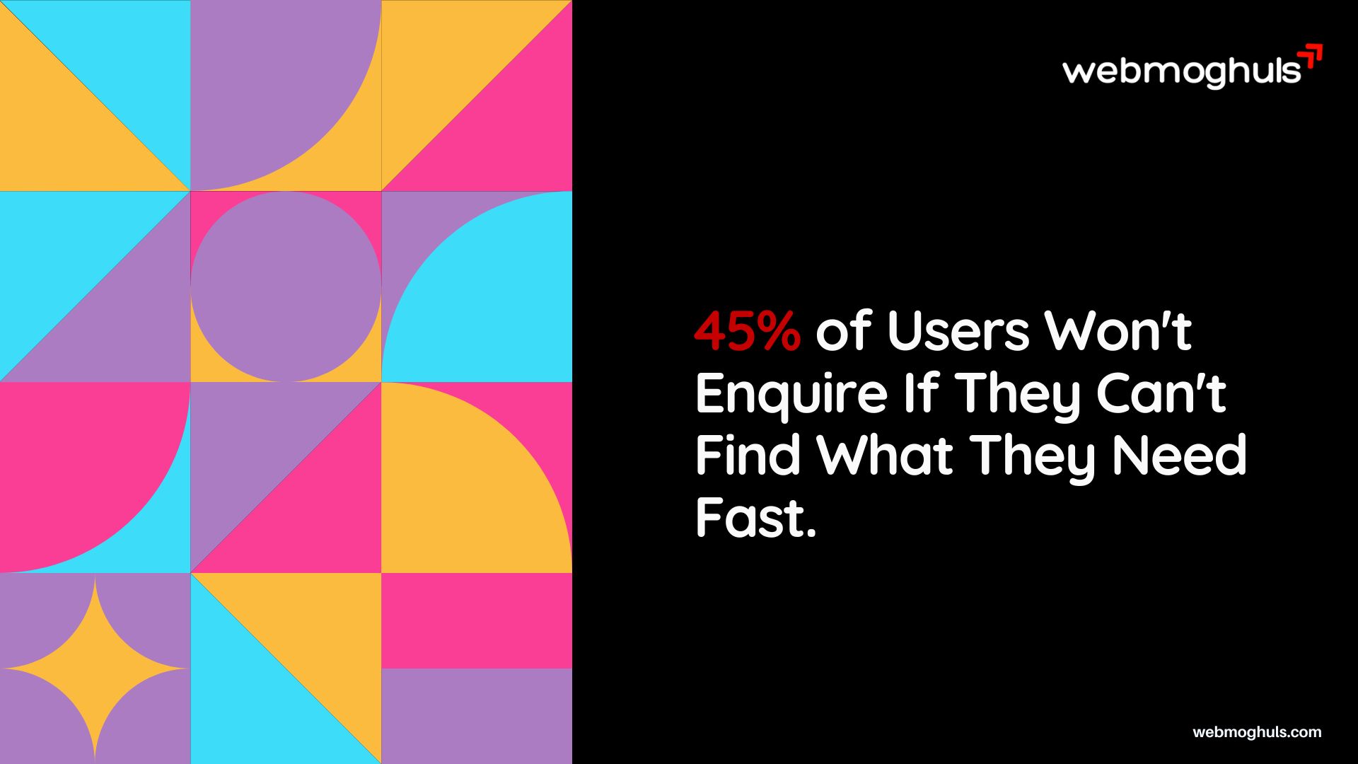
A 2023 report by Forrester Research found that 45% of users won’t complete a purchase or enquiry if they can’t quickly find what they’re looking for. That’s not a content problem. That’s a UX and structure problem.
The bottom line: fixing your website’s lead generation isn’t about doing more — it’s about removing friction, building trust faster, and making the next step blindingly obvious.
Your Homepage Is Working Against You
If there’s one page on your website that carries the most weight in lead generation, it’s the homepage. It has to do three things simultaneously: communicate what you do, establish why you’re credible, and tell visitors what to do next. Most homepages fail at all three.
The “We Help Businesses Grow” Trap
Look at your homepage headline right now. Does it say something like “Empowering businesses with innovative solutions” or “Your trusted partner for digital growth”? If so, you’ve described approximately every other company on the internet.
A headline that means everything ends up meaning nothing. Your visitor should read your H1 and immediately understand: who you help, what you help them achieve, and why you’re different. That’s a tight brief for 10 words, but it’s achievable. Compare:
Weak: “Full-Service Digital Agency for Modern Businesses”
Strong: “We Design Websites That Turn Visitors Into Customers — For Service Businesses in the US and UK”
The second version has a specific audience, a specific outcome, and a directional promise. Visitors self-select in or out immediately.
The Scroll-to-Find-the-Point Problem
Research by Nielsen Norman Group consistently shows that users spend the majority of their time above the fold. If your core value proposition, your primary service, and your CTA aren’t visible without scrolling, you’ve already lost a significant chunk of your visitors.
This doesn’t mean cramming everything into the first screen. It means structuring your above-the-fold section with ruthless discipline: one headline, one supporting subheadline, one clear CTA button. Everything else — case studies, team bios, testimonials — lives below that line and supports the decision the visitor already wants to make.
What Your Homepage Structure Should Look Like
A homepage built for lead generation follows a specific logic. It isn’t random. Every section earns its place by moving the visitor one step closer to taking action. Here’s the structure that consistently performs:
Section 1 — The Hook (Above the Fold): Your headline addresses the visitor’s core goal or pain. Your subheadline adds one layer of context — who you are and what makes you different. A single CTA button with action-oriented copy. A secondary trust signal — a client logo strip, a number (“We’ve built 300+ websites for SMBs across the US and UK”), or a short proof statement.
Section 2 — The Problem: Before you talk about your service, name the pain. “Most service businesses get website traffic but zero enquiries. Here’s why that happens — and how to fix it.” This mirrors the visitor’s own internal monologue. When visitors see their problem articulated clearly, they stop scanning and start reading.
Section 3 — The Solution (Your Services): Now present your services — but frame them as solutions, not inventory. Not “We offer web design, SEO, and PPC.” But “We build websites designed to generate enquiries, optimise them for search visibility, and run the paid campaigns that send the right traffic to them.”
Section 4 — Proof: Case studies, testimonials, or client logos. Specific, outcome-based, and close to the visitor’s own context. This section builds the credibility that converts a curious visitor into a confident one.
Section 5 — Process: What happens after someone gets in touch? Walk them through it. “Step 1: We review your site. Step 2: We present a fix strategy. Step 3: We build and test.” Removing the mystery of the sales process removes a major objection.
Section 6 — Final CTA: A focused close. Restate the offer, address the final hesitation (“No long-term contracts. No account managers. Direct access to senior designers and strategists.”), and present the CTA again.
This structure works because it follows how decisions are actually made — not by rational evaluation of features, but by a progression from recognition (“they understand my problem”) through trust (“they’ve solved it for others like me”) to action (“I know what happens next, so I’ll reach out”).
Our Take — From the Trenches
We’ve audited dozens of websites from US-based SMBs, B2B companies, and professional service firms over the years. The pattern we see most frequently isn’t bad design — it’s a homepage built to impress the CEO rather than convert a prospect. Lots of brand storytelling, beautiful imagery, and almost zero clarity about what the company actually does or who it serves. When we rebuild these homepages with conversion intent at the centre, enquiry rates improve — sometimes dramatically — within the first few weeks. The design doesn’t have to get uglier. It just has to get clearer.
Poor UX Is Silently Killing Your Lead Generation
You can have the right message and still lose leads if the experience of navigating your website feels broken, slow, or confusing. UX issues are invisible to the business owner but painfully obvious to every visitor. And they cost you leads every single day.
Site Speed: The Silent Conversion Killer
Google has published extensive research on the relationship between load time and conversion rate. A page that takes 3 seconds to load has a 32% higher bounce rate than one that loads in 1 second. At 5 seconds, that jump is 90%. Those aren’t abstract percentages — that’s half your paid traffic walking out before reading a single word.
Page speed has two dimensions most people overlook: the technical side (hosting quality, image compression, script bloat) and the perceived speed (how fast does it feel even if the full page hasn’t loaded). Both matter. Prioritise rendering above-the-fold content first, compress all images to WebP format, and audit your third-party scripts — most websites are carrying dead weight from analytics tools, chat widgets, and tracking pixels that add seconds of delay.
Mobile UX: Where Most Lead Funnels Collapse
More than 60% of web traffic globally now comes from mobile devices, according to Statista’s 2024 data. Yet the majority of B2B and service websites are still designed desktop-first, with mobile treated as an afterthought. The result: forms that are hard to tap, buttons too small to press, text that requires horizontal scrolling, and CTAs that fall off-screen.
If your enquiry form has more than four fields on mobile, your completion rate is suffering. If your phone number isn’t clickable on mobile, you’re leaving direct leads on the table. These aren’t complex fixes — they require deliberate mobile-first design thinking, not just responsive CSS.
Navigation That Confuses Instead of Guides
Your navigation is a decision tree. Every option you add creates another fork in the road. Most visitors aren’t trying to explore your website — they’re trying to solve a problem. They want to find the service, understand the credibility signals, and get in touch. A navigation menu with 10 top-level items doesn’t help that journey. It creates noise.
A focused navigation — 5 to 6 items maximum, with one of them being a prominently styled “Contact” or “Get a Quote” button — removes ambiguity and guides visitors where they need to go.
For companies looking to significantly improve how visitors move through their site, the underlying structure of a professional web design matters as much as the visual layer. Navigation, hierarchy, and page architecture are design decisions, not just content ones.
Broken User Journeys and Dead-End Pages
Here’s a test worth doing right now: open your website, pretend you’re a first-time visitor with a specific problem, and try to find the page that most directly addresses that problem. Count how many clicks it takes. Most service websites have user journeys that are broken at multiple points — pages that end with no CTA, service pages that don’t link to related services, blog posts that don’t point back to any offer.
Every page on your website should have one clear next step. A blog post about “common web design mistakes” should offer a logical next step — perhaps an audit, a related service page, or a deeper content piece. A service page should end with a CTA and a proof section. If you have pages with no logical next action, you’re letting interested visitors reach a dead end.
Think of your website as a physical space. Every room (page) should have a door that leads somewhere useful. Dead ends frustrate people in physical spaces, and they frustrate website visitors too — they just express it by closing the tab instead of complaining out loud.
The Impact of Poor Accessibility on Lead Generation
Accessibility isn’t just an ethical responsibility — it directly affects your conversion rate. Websites that fail basic accessibility standards: insufficient colour contrast, missing alt text, non-keyboard-navigable forms, and absence of clear focus states for interactive elements, also fail a portion of their audience. The World Health Organisation estimates that over 1 billion people globally live with some form of disability. If your website doesn’t work for them, you’re actively excluding potential leads.
Web Content Accessibility Guidelines (WCAG) 2.1 compliance is increasingly important not only for inclusion but also because search engines use many of the same signals as accessibility tools. Clear heading hierarchy, descriptive link text, fast load times on constrained connections — these are good for accessibility and good for SEO simultaneously.
The practical fix isn’t a comprehensive accessibility audit from day one. It’s implementing the fundamentals: minimum 4.5:1 colour contrast ratio for body text, clickable elements with a minimum 44x44px touch target, all form fields with visible and descriptive labels, and logical tab order through interactive elements.
Chatbots That Hurt More Than They Help
Plenty of businesses add live chat or chatbot widgets to their website hoping to capture more leads. In some cases it works. In many cases, it actively reduces conversions. Intrusive chat pop-ups that appear within five seconds of landing on a page, chatbots that give unhelpful scripted responses to specific questions, and chat widgets that block mobile content all create friction rather than reducing it.
If you’re using a chat widget, delay its appearance by at least 30 seconds or trigger it based on scroll depth — not on landing. Make sure the bot can handle the most common questions your real sales team receives. If it can’t, direct users to a human quickly rather than looping them through irrelevant automated responses. A poorly implemented chatbot doesn’t just fail to generate leads — it damages trust in the brand that deployed it.
Your CTAs Don’t Ask for the Right Thing at the Right Time
A Call to Action (CTA) is the bridge between a visitor who is interested and a visitor who becomes a lead. Most websites get CTAs wrong in one of three ways: they’re too vague, they ask for too much too soon, or they appear in all the wrong places.
The “Contact Us” Problem
“Contact Us” is the most common CTA on business websites. It’s also one of the weakest. It tells the visitor nothing about what they’ll get, what will happen next, or why they should bother.
Compare these CTAs for a web design agency:
- “Contact Us” — generic, low-commitment framing
- “Get a Free Website Audit” — specific, value-first, low barrier
- “See How We’d Redesign Your Site” — curiosity-driven, outcome-oriented
The second and third options tell the visitor exactly what they’re getting. They reduce perceived risk. They move the conversation from “I need to buy something” to “I’m going to get something useful first.” For service businesses where the sales cycle is longer, value-first CTAs convert meaningfully better than transactional ones.
CTA Placement: The Fold Isn’t Enough
Many websites place one CTA at the top of the page and consider the job done. But visitors make their decision at different points in the journey. Some are ready on arrival. Others need to read three sections before they trust you enough to reach out. Others scroll to the bottom, looking for social proof before committing.
A high-converting page places CTAs at multiple points:
- Above the fold (for the ready-now visitors)
- After proof sections — testimonials, case studies, results (for the consideration-stage visitors)
- At the bottom of the page (for the thorough readers)
- Within relevant body content (contextual CTAs tied to specific services or pain points)
This isn’t repetitive or aggressive — it’s meeting the visitor wherever they are in their decision process.
Form Fields: The Shorter, the Better
Baymard Institute’s research consistently shows that excessive form fields are one of the leading causes of form abandonment. Every field you add to an enquiry form asks for more trust than you’ve earned. For a first contact, you need a name, email, and one open-ended question at most. Everything else can be gathered in the discovery call.
Your Website Doesn’t Build Trust Quickly Enough
Trust is the invisible variable in every lead generation equation. Visitors don’t buy from websites they don’t trust — and trust is fragile, especially for businesses they’ve found through a search query rather than a personal referral. You have a few seconds to establish credibility. Most websites spend those seconds on decorative content instead of proof.
Social Proof: Why “We’re Great” Doesn’t Work
Self-promotion is the least effective form of trust-building. Testimonials, case studies, client logos, review ratings, and third-party endorsements are what actually move the needle. The closer the proof is to the visitor’s own situation — same industry, same problem, same geography — the more powerful it is.
A testimonial from a “happy customer” is weak. A testimonial from a “London-based legal firm that increased client enquiries by 60% within three months” is a conversion asset. Specificity transforms praise into proof.
HubSpot’s research has consistently shown that websites featuring customer testimonials and case studies generate significantly higher conversion rates than those without them. If your social proof section is a wall of headshots and star ratings with no substance behind them, you’re leaving persuasion on the table.
Trust Signals That Work for Service Businesses
Beyond testimonials, there are several credibility signals that move visitors from cautious to confident:
- Named team members with real photos — People buy from people. Showing the actual humans who’ll do the work is far more powerful than stock photography.
- Case studies with before/after context — Not just “we built a website” but “this client had a 1.2% conversion rate, we rebuilt the UX, it climbed to 3.8% in 90 days.”
- Transparent process information — What happens after someone gets in touch? Visitors are less likely to enquire if they don’t know what they’re walking into.
- Industry recognitions, press mentions, or partnerships — Third-party validation that isn’t controlled by you carries outsized weight.
- Response time commitments — “We respond within one business day” removes a common anxiety about reaching out to agencies.
Building Trust Through Content Depth
There’s a longer game in trust-building that most service businesses ignore: content that demonstrates genuine expertise rather than just claiming it. A blog post that goes three levels deeper than anything else on the topic, a genuinely useful guide that solves a real problem, a breakdown of a process that most competitors keep deliberately opaque — all of these communicate competence without requiring a visitor to take you at your word.
For Webmoghuls, this is a core principle. A potential client in New York or Dubai has never met our team. They’re making a decision about whether to trust an agency based in India with a significant investment in their business’s digital presence. The trust gap is real, and it won’t close with a generic “About Us” page. It closes through published expertise, specific proof, transparent process, and direct communication that doesn’t hide behind account managers or sales scripts.
According to research by Salesforce, 88% of buyers say the experience a company provides is as important as its products or services. For a web design agency, the website itself is the experience. It has to model the quality of work you do, not just describe it.
The Missing “About” Page Problem
The About page is one of the most visited pages on any service business website — and one of the most neglected. Visitors who are close to a decision often go to About to answer a fundamental question: “Can I trust these people with my business?”
An About page that leads with brand philosophy and ends with a team photo grid misses the opportunity entirely. The most effective About pages answer: why this company exists, who specifically leads the work, what makes the approach different, and what clients say about working with them.
The best-performing About pages for service businesses also address the elephant in the room — whatever objection is most common in the sales process. For an Indian agency serving Western markets, that might be time zones, communication quality, or whether senior people actually do the work. Addressing these directly, with specifics rather than platitudes, converts sceptical visitors faster than any amount of generic brand storytelling.
Why Pricing Transparency Builds Trust (Even for Custom Services)
Most service businesses avoid publishing pricing because every project is different. That’s reasonable. But the total absence of any pricing context creates a different kind of friction: visitors have no idea whether your services are in their budget range, so they either assume you’re too expensive and leave, or they enquire and waste both parties’ time.
There’s a middle path. Instead of hiding pricing entirely, consider publishing a “starting from” figure for your core services, or a project range bracket (“most client projects fall between $5,000 and $20,000”). This filters out leads who are genuinely outside your range while reassuring prospects who are a good fit that they’re not wasting their time by reaching out.
Research from a HubSpot study on B2B buying behaviour shows that pricing and budget information is one of the most commonly searched pieces of information during the research phase. Being forthcoming about your pricing framework — even without specific numbers — positions you as more trustworthy than competitors who treat price as a closely guarded secret.
Your SEO Is Sending the Wrong People to Your Site
This one surprises business owners who’ve invested in SEO: sometimes the problem isn’t that your website isn’t found — it’s that it’s being found by the wrong audience. Traffic that was never going to convert isn’t a conversion problem. It’s a targeting problem.
Keyword Intent Mismatch
Not all traffic is equal. Someone searching “what is web design” has informational intent. Someone searching “hire web design agency in Dubai” has transactional intent. If your SEO strategy has accidentally prioritised high-volume informational keywords over lower-volume commercial and transactional keywords, you’ll have impressive traffic numbers and dismal enquiry rates.
A lead generation audit always starts with intent analysis — looking at which keywords are actually sending traffic and whether those visitors have any plausible reason to become customers. This is one of the first things we assess when businesses come to us asking why their website isn’t generating leads.
Effective SEO services aren’t just about rankings — they’re about ranking for the terms that bring buyers, not browsers.
Landing Page Misalignment
If you’re running paid ads — Google Ads, LinkedIn campaigns, Meta campaigns — and sending traffic to your homepage, you’re leaking budget. Homepages are designed for broad audiences. Ad campaigns are targeted at specific audiences with specific problems. The landing page should reflect exactly what the ad promised: same message, same offer, same visual direction.
A user who clicks a Google Ad for “Shopify redesign agency” and lands on a generic web design homepage has to do mental work to connect the dots. Most won’t. A dedicated landing page that mirrors the ad message, builds relevant credibility, and presents a single CTA will consistently outperform the homepage for converting paid traffic.
Local SEO Gaps for Service Businesses
For businesses serving clients in specific geographies — a law firm in Melbourne, an accountancy practice in Manchester, a healthcare provider in Toronto — local SEO signals are non-negotiable. If your Google Business Profile is incomplete, your local citations are inconsistent, or your website doesn’t have location-specific service pages, you’re effectively invisible to searches like “web design agency near me” or “SEO services in [city].”
Google’s local ranking algorithm weighs three factors heavily: relevance (how well your business matches the search intent), distance (physical proximity to the searcher), and prominence (how authoritative and well-cited you appear online). All three are addressable with the right strategy.
Content That Ranks But Doesn’t Convert
There’s a specific failure mode worth calling out: publishing excellent informational content that drives substantial traffic but almost no leads. This happens when a content strategy is built around SEO volume rather than buyer intent. Articles like “what is conversion rate optimisation” or “how does SEO work” can rank on page one of Google and attract thousands of monthly visitors who are researchers, students, or people in entirely different industries. None of them are buying.
The fix isn’t to stop publishing informational content — it has genuine SEO and brand value. The fix is to build conversion bridges within that content. A well-written educational post on “how to fix a website that isn’t generating leads” should have two or three natural points where it invites a reader who’s recognising their own situation to take a next step. An inline CTA offering a free audit, a contextual link to the relevant service page, or a related case study embedded within the content — these bridges convert the informational traffic that would otherwise leave without engaging.
Technical SEO Problems That Hurt Conversion Indirectly
Technical SEO issues don’t just affect rankings — they affect conversion. Pages with duplicate content confuse search engines and dilute ranking authority. Broken internal links frustrate both visitors and crawlers. Missing or poorly written meta descriptions reduce click-through rates from the search results page before a visitor even arrives. Redirect chains slow page loads and create a poor first impression.
A technical SEO audit addresses issues that are invisible to visitors but constantly costing you traffic quality and conversion rate. Canonical tags, structured data, XML sitemaps, robots.txt configuration, and Core Web Vitals scores all feed into the overall health of how your site performs in search — and by extension, how many qualified leads it attracts.
For businesses that have invested in website design and content but haven’t addressed the technical SEO layer, this is often where the biggest untapped potential sits. It’s not glamorous work, but fixing a crawl error or implementing proper schema markup can produce meaningful improvements in search visibility within 60 days.
Our Take — From the Trenches
We work with a lot of businesses who’ve tried SEO before and seen minimal results. When we audit their setups, the problem is usually one of three things: they were optimising for the wrong keywords (high volume, low intent), their technical foundations were broken so rankings never stuck, or their landing pages couldn’t convert the traffic even when it arrived. Effective SEO is a full-stack discipline — you can’t separate rankings from conversion and expect either to perform well. Our SEO services are built around this integrated approach: fix the technical foundation, target the right audience, and make sure the pages they land on are designed to convert.
Website Design Mistakes That Reduce Conversions
Design is functional. Every visual decision — colour, typography, spacing, hierarchy — either aids or undermines the conversion journey. When design is treated purely as an aesthetic exercise, lead generation suffers.
Visual Hierarchy Failures
Visual hierarchy is the art of making the most important elements the most visually prominent. When everything on a page screams for attention equally, the visitor’s eye has nowhere to go. They scan, feel overwhelmed, and leave.
A high-converting page uses size, contrast, whitespace, and colour to create a clear reading path: headline → supporting detail → credibility signal → CTA. Everything else is supporting cast. If your CTA button is the same visual weight as the navigation links, you’ve lost the hierarchy battle.
UX/UI design isn’t decoration — it’s the invisible architecture that makes a website work. Conversion-focused UX design treats every element as either moving the visitor forward or standing in their way.
Colour and Contrast Issues
Colour affects conversion more than most business owners realise. A CTA button that blends into the page design is effectively invisible. A colour palette that creates insufficient contrast between text and background fails accessibility standards and makes content harder to read.
The specific colour you choose for your CTA button matters less than the contrast it creates with the surrounding elements. A bright orange CTA on a predominantly grey-and-white page will outperform a blue CTA that matches the overall brand colour scheme — not because orange is magical, but because contrast creates attention.
Typography That Undermines Credibility
Fonts communicate before words do. A professional service firm using Comic Sans or an overly decorative display font signals misalignment between claimed expertise and visual presentation. Equally, a startup using a generic system font on their website loses the brand personality opportunity entirely.
Typography should be legible at all sizes, appropriate to the brand’s market positioning, and consistent throughout the site. Body text that’s too small to read on mobile, line heights that cause text to run together, or headlines that use a font radically different from the body — these are friction points that erode trust without the visitor consciously knowing why.
Image Choices That Harm Conversion
Stock photos are ubiquitous and immediately recognisable as stock photos. When a visitor lands on a service page featuring smiling strangers in a generic office setting, it creates a subtle but real disconnect: this company doesn’t feel real. It feels like a template.
Genuine photography — real team members, real workspaces, real work-in-progress — builds a connection that stock imagery cannot. If budget constraints make bespoke photography impossible right now, the alternative isn’t better stock photography. It’s a considered use of design elements, iconography, and illustration that creates personality without pretending to be something it isn’t. Abstract design assets communicate intentionality. Generic stock photos communicate the absence of it.
For product or e-commerce websites, image quality is even more directly tied to conversion. Research by Baymard Institute shows that product images are the most important feature for online purchase decisions, outranking reviews, price comparisons, and delivery information. If your product images are low resolution, poorly lit, or lacking multiple angles and context shots, you’re fighting a conversion battle with both hands tied.
Page Length vs. Page Depth: Getting the Balance Right
One of the most debated questions in conversion optimisation is how long a web page should be. The honest answer: as long as it needs to be to convert the visitor at their stage of the buying journey, and no longer.
For high-consideration purchases — a web design project, an SEO retainer, a software subscription — buyers need more information before committing. They want to understand the process, see the proof, grasp the pricing framework, and feel the personality of the team. A longer page serves that research need. For lower-consideration purchases or simple lead capture (a newsletter signup, a consultation booking), shorter is almost always better.
The mistake most businesses make isn’t writing pages that are too long or too short — it’s writing pages that are the wrong length relative to what the visitor needs to make a confident decision. If your service page is three paragraphs and a form, you’re probably leaving trust-building work undone. If it’s 5,000 words of company history and industry background before getting to the service, you’re creating friction for buyers who are already convinced and just need a clear path to contact.
Our Take — From the Trenches
We’ve rebuilt platforms that were originally built by well-intentioned in-house teams or freelancers who prioritised visual appeal over conversion architecture. The design often looks fine — sometimes very good. But when you look at the data, the problems are clear: visitors are scrolling past the CTA without seeing it, the mobile experience has never been tested on an actual device, and the page structure follows no logical decision-making path. Good design and high-converting design are not the same thing. Our UX/UI design services are built specifically around conversion — every design decision is tied to a measurable outcome, not just an aesthetic preference.
How to Fix a Website That’s Not Generating Leads: A Step-by-Step Process
This isn’t theory. Here’s a practical sequence for diagnosing and fixing a lead generation problem, in the order we’d approach it for a client.
Step 1: Install heatmap and session recording tools Before changing anything, understand what’s actually happening. Tools like Hotjar or Microsoft Clarity show you exactly where visitors are dropping off, what they’re clicking, how far they’re scrolling. Data before decisions.
Step 2: Audit your analytics for traffic intent In GA4, segment your traffic by source and look at the conversion behaviour of each segment. Organic visitors from informational keywords will behave differently to direct traffic or paid visitors. Identify which segments have the highest intent and focus your optimisation efforts there first.
Step 3: Rewrite your homepage headline and subheadline Using what you know from your best clients — their specific problem, their industry, their goal — rewrite your homepage headline to be specific, benefit-led, and audience-targeted. Test two versions if you can.
Step 4: Reduce your primary CTA form to three fields Name, email, and one open-ended question (“What are you looking to achieve?”). Remove everything else. Test the impact on submission rate over a 30-day period.
Step 5: Add specific, outcome-based testimonials Take your existing testimonials and rewrite them (with client permission) to include specifics: the problem they had before, what changed, and a quantified result where possible. Place them immediately before your CTA sections.
Step 6: Audit your page speed with Google PageSpeed Insights Fix your Core Web Vitals, compress images, defer non-critical scripts. Target a mobile score above 70 and a desktop score above 85.
Step 7: Create one dedicated landing page for your highest-value service This page should have a single focus: one audience, one pain point, one CTA. No navigation links to distract. No sidebar. Nothing that takes attention away from the conversion goal.
Step 8: Review your keyword targeting against commercial intent Pull your top traffic-driving keywords and check their intent. If the majority are informational, map your content strategy to add more commercial and transactional content targeting buyers, not researchers.
The bottom line: most websites that aren’t generating leads have three to five specific fixable problems. You don’t need to rebuild from scratch — you need to diagnose accurately and fix surgically.
What a High-Converting Lead Generation Website Actually Looks Like
The best lead-generating websites aren’t the ones with the most impressive animations or the longest service pages. They’re the ones that make the visitor feel immediately understood, quickly convinced, and effortlessly guided to take action.
Here’s what they have in common:
A specific, outcome-focused headline that names who you help and what they achieve. Not a tagline. Not a mission statement. A direct value proposition aimed at the person most likely to buy.
One primary CTA above the fold — high contrast, action-oriented, positioned where the eye naturally lands after the headline. Not buried. Not competing with five other links.
Proof within the first two scrolls — a recognisable client logo, a specific testimonial, or a quantified result that establishes credibility before the visitor has any reason to question it.
A fast, mobile-native experience — pages that load in under two seconds on a mobile connection, tap targets that work with a thumb, forms that don’t require zooming or scrolling to complete.
A clear, linear user journey — each section of the page flows logically to the next, and every flow ends at the same place: the CTA. There are no dead ends. There are no distractions.
Content that speaks to the visitor’s problem first, and the solution second — too many websites talk about themselves. The best lead generation pages talk about the visitor’s problem in enough detail that the visitor feels heard — and only then present the solution.
This kind of website isn’t built by chance. It’s the result of deliberate UX thinking, conversion-focused copy, and design decisions made in service of a single goal: turning visitors into leads.
Final Thoughts
The gap between a website that generates leads and one that doesn’t is rarely about aesthetics. It’s almost always about clarity, trust, and friction. Your homepage headline may be too vague. Your CTA may be asking too much too soon. Your mobile experience may be costing you more leads than any marketing campaign could recover. Your SEO may be attracting the wrong audience entirely.
The most important takeaway from everything in this post is this: lead generation problems are diagnosable. They’re not mysterious. With the right data — heatmaps, GA4 segmentation, conversion funnel analysis — you can pinpoint exactly where visitors are deciding not to enquire. Once you can see the problem clearly, the fix is usually straightforward.
The second most important takeaway: don’t rebuild before you diagnose. Businesses spend tens of thousands of dollars on full website redesigns when the real problem was a confusing homepage headline and a form with too many fields. Fix what’s broken first. Scale what works.
The forward-looking question worth sitting with: as AI-powered search engines like Google SGE and Perplexity change how your website gets discovered, the bar for trust, authority, and conversion quality is only going up. The websites that generate leads in 2026 and beyond won’t just be the ones with the best traffic — they’ll be the ones that visitors immediately trust and find it effortless to engage with.
Is your website getting traffic but not converting?
At Webmoghuls, we’ve helped service businesses, B2B companies, and e-commerce brands across the US, UK, UAE, and Australia diagnose exactly why their website isn’t generating leads — and rebuild the experience so that it does. Whether you need a full website redesign, a conversion audit, or a targeted UX overhaul, we’ll tell you honestly what’s holding your site back.
Schedule a free consultation → webmoghuls.com/contact
Frequently Asked Questions
Why does my website get traffic but no leads?
Traffic without leads usually means there’s a conversion problem, not a visibility problem. The most common causes are a vague homepage headline that doesn’t communicate your value clearly, a weak or hard-to-find call to action, slow page load times, or traffic that doesn’t match your buyer’s intent. More often than not, fixing two or three structural issues on your homepage and key service pages is enough to reverse the trend.
How long does it take to see results after fixing website lead generation issues?
Most conversion improvements produce measurable results within 30 to 60 days of implementation. Changes to CTA placement, headline copy, and form length tend to show impact quickly. Structural SEO improvements — like better keyword targeting and improved page authority — typically take 60 to 90 days to reflect in organic traffic quality. The fastest wins come from fixing UX friction and CTA clarity on your highest-traffic pages first.
What is website conversion rate optimisation and how does it help generate more leads?
Website conversion rate optimisation (CRO) is the process of improving a website so that a higher percentage of its existing visitors take a desired action — filling out an enquiry form, booking a call, or requesting a quote. Instead of spending more on advertising to increase traffic, CRO focuses on getting more value from the traffic you already have. Even a 1% improvement in conversion rate can meaningfully increase lead volume without increasing your marketing budget.
How can Webmoghuls help if my website isn’t converting?
Webmoghuls starts with a conversion audit — analysing your current traffic data, identifying where visitors drop off, and diagnosing the specific UX, design, and messaging issues that are costing you leads. From there, we build a prioritised fix plan and implement changes through our web design and UX/UI services. Many clients see meaningful improvement in enquiry volume within the first 60 days without requiring a full website rebuild.
Which website mistakes reduce lead generation the most?
The five most impactful website mistakes for lead generation are: a homepage headline that’s too generic to resonate with your specific audience, a primary CTA that’s weak or buried below the fold, page load speeds over three seconds on mobile, excessive form fields that create friction before the enquiry is submitted, and a lack of specific social proof — testimonials without outcomes, case studies without numbers. Fixing these five areas addresses the majority of conversion problems on most service business websites.
How many CTAs should a lead generation website have?
A lead generation page should have multiple CTAs placed at strategic points: one above the fold for ready-to-act visitors, one after your main credibility or social proof section, and one at the bottom of the page. Each CTA should be specific and low-friction — “Get a Free Website Audit” performs better than “Contact Us” because it tells the visitor what they’ll receive. Three to four CTAs on a standard service page is appropriate; anything more starts to feel pushy rather than helpful.